Buisness Portraits C&C please

Nein-reis

TPF Noob!
Joined
May 1, 2007
Messages
454
Reaction score
1
Location
Utah
Can others edit my Photos
Photos NOT OK to edit
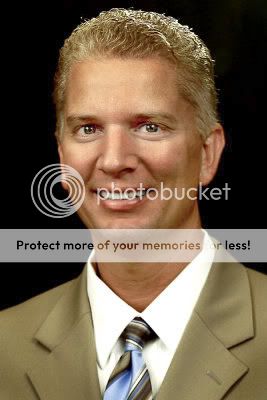
This is head shot Session I did with a Home Loan Consultant for his buisness cards, advertisemnts, brochures, etc... Before I give them to him I wanted to see what you guys think.

1.
medium.jpg


2.
medium.jpg


3.
medium.jpg


4.
medium.jpg


5.
medium.jpg


Thanks for looking :thumbup:
 
I think that either 3 or 5 work the best
 
I think #1 or #3 would work the best for a Buisness card. I just think buisness cards should look more formal, hence the suit ones:) As far as the photo's I think they are great, nice and sharp! I do think the light on the face on #4 is the best, the others being a tad darker. Not a big problem though!
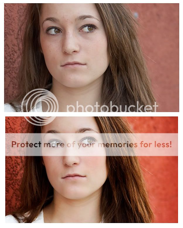
Nice work:)
 
You're right, they are too dark. I was paying too much attention to skin tone that I ignored the light. I will lighten them up.... Thanks alot! If That the only thing wrong with these then I'm pretty happy! First time using these lights too...
 
Ok I lightened them up. Are they better now, or too bright?
 
It may just be me, I haven't calibrated my moniter in a few months (oops) but these seem to have a very heavy yellow cast (except 3, which seems blue) to the skin tones.
I prefer 1 or 5 for a business card. Can I quickly take one into Photoshop and see if I can play with the skin tones?
 
Here is a two second fix (if you would like me to take it down, I will most certainly, I am just running from the assumption under your name it is okay :))

I actually think I swung to far in the magenta direction, but I just used colour blance with the values -25, -25, 15, and a touch of cuves, some of the shadows such as those near his eyes, could be further lightened in the full resolution version.
deleteme.jpg
 
I think I it right now #2, #3, and #4 might still have a slight too much yellow in them. I think my calibration is a little off. But I'm happy with the brightness now. Just a little curve manipulation. I havn't done much to these, the first time they were up it was just straight out of the camera with a resize.

I'll take the yellow out of them now, thanks for noticing Peanuts... when I've been working on them for a while my eyes can get use to them and the yellow cast slipped past me.
 
why didn't you tried to do this set in some fresh, more business related style ? in my opinion better efect would be if you could try to arange this photos in some office. Try to do portraits of bussines man at work, and than solo portrait in business area. I think that it would be better
 
busportraits_ed.jpg


This is the best photo of the gentleman. As to clothes the problem is that a suit is too formal in the current business environment and the shirt is a little too informal for office meetings with customers. The trend is toward an open-neck shirt of a solid colour with a casual jacket or blazer.
 
He is square to the camera in all of them. Not a good thing my friend. My biggest critique though is your camera position. You are too low. He is looking down at you in all of them. In classical portraiture, headshots are usually best taken from about the subject's eye level. His head is going straight up and down and looks very static. I think the light is flat as well.

http://groups.msn.com/Asktheoleproaboutphotography/joezeltsman.msnw <-Read the posing articles for more info about headshots.

I personally think #5 is the best all around due to the darker colors not distracting from his face as much as the others.
 
Did you use the dodge and burn tool in PS? It seems like some parts of the face are overly highlighted and the shadows are excessive. Maybe it's just me?

#2 works the best :)
 
Here's my edit! I lightened up the face, whitened teeth, toned down yellow cast. Hope this helps!

medium.jpg
 

Most reactions

New Topics

Back
Top