typicalteen
TPF Noob!
- Joined
- Sep 2, 2004
- Messages
- 2
- Reaction score
- 0
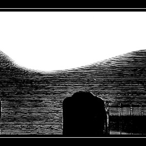
hello, this was taken with my canon elan 7n and a 70-200mm f/4 lens. i dont know the shutterspeed or aperture sorry. the film is Tmax 400 BW. It was scanned on a bad flatbed which explains the poor quality.
some questions:
1) would the image work better flipped horizontally?
2) how is the composition and exposure?
3) Is the reflector on the wheel on the bottom of the image distracting?
4) Is the gap in the bikes distracting?
5) The first bike (point of focus) is grey while the next few are white. Does this take away from the image?
im looking for serious critique, please be brutal and honest.

if anyone can tell me how to get the image to show up directly it would be nice
thanks in advance and feel free to edit it yourself and post
P.S. can someone please link to an article on how to convert images to bw from color using the channel mixer?
some questions:
1) would the image work better flipped horizontally?
2) how is the composition and exposure?
3) Is the reflector on the wheel on the bottom of the image distracting?
4) Is the gap in the bikes distracting?
5) The first bike (point of focus) is grey while the next few are white. Does this take away from the image?
im looking for serious critique, please be brutal and honest.
if anyone can tell me how to get the image to show up directly it would be nice
thanks in advance and feel free to edit it yourself and post
P.S. can someone please link to an article on how to convert images to bw from color using the channel mixer?

![[No title]](/data/xfmg/thumbnail/38/38739-1ad36a46750bafbe805f009b4453e8be.jpg?1619738703)

![[No title]](/data/xfmg/thumbnail/38/38740-d1a7721cf77e9309a9b4a4829c65fdd4.jpg?1619738704)