C&C - office picture, first go around

theregoesjb

TPF Noob!
Joined
Nov 4, 2011
Messages
158
Reaction score
5
Location
boston
Can others edit my Photos
Photos OK to edit
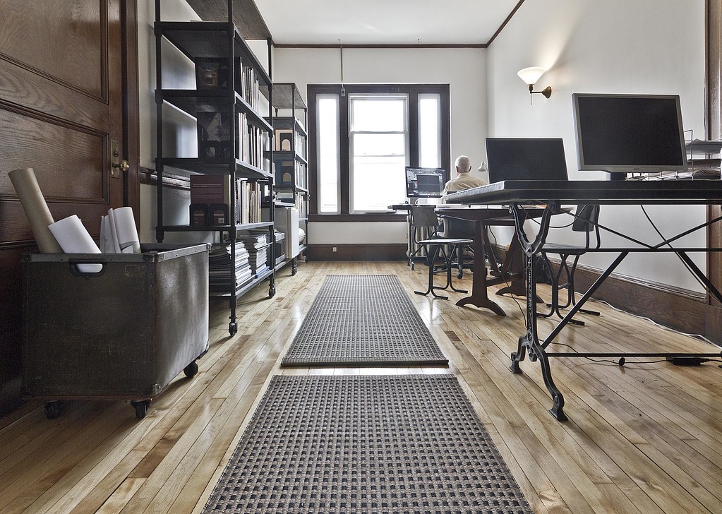
So this is sort of a first pass for some office pictures I am taking for our website (which currently shows the old office). I did very little to clean the place up as I was just trying to get an idea of framing and lighting. Computer cables and laptops will be removed later on, flat screens will likely stay.

A couple issues though:
  • Positioning the various furniture. There are two desks along the wall on the right, and a small round wooden table with two wooden chairs that sits between the desks. Should I straighten out the legs of the wood table so they are parallel or perpendicular with the desks? Instead of the mid-angle its at now? Should chairs be neatly faced into their desk/table?
  • Whether or not to have anyone sitting at the desk, I assumed not, but what are peoples thoughts?
  • The window at the end of the room has an AC unit screwed into the frame. It could probably be removed with effort but we're trying to avoid that. My quick solution was just to allow the window to be blown out and photoshopped the "blown out" effect over the AC (as seen). Thoughts?

blown out window cropped by justinbin84, on Flickr
 
Last edited:
What's the purpose of the photo?
 
What's the purpose of the photo?
just trying to show the office a bit on our website, it will go along with a little blurb about us and how we've recently moved to the area into our new space.

If it wasnt for me being into photography a little bit my boss would have probably just used his iphone to take a picture of the space.

So regardless of the use I'm just curious of peoples opinions of how to improve such a picture (if anyone has any thoughts).
 
Some general thoughts. While I don't have any experience with this type of photography, I have a few comments/questions--take it with a grain of salt, YMMV. Others may have better comments.
  • I realize you took this at 10 mm with a T2i, but any chance of renting a FF and a wide angle lens? I'm not really liking the cutoff door, bookcases, and desk. If you can't, any chance of stitching several photos together?
  • It's quite a low perspective.. I'd rather it a bit higher. It looks like you're below the doorknob. That's too low, IMO. More room up top.
  • I'm not fond of the blown window. Does the AC look that bad? What is out that window? If sky/landscape, can you clone out the AC with the sky/landscape?
  • You may also want to think about combining multiple exposures...
  • Maybe organize the posters/drawings/whatever they are in the cart on the left?
  • Turn on your screens (or Photoshop screens on there) showing what you do? For example, put some geometric shape in Illustrator/AutoCAD or a map in GIS, or whatever. Something other than a black screen.
Thanks a bunch for the feedback, definitely not renting any equipment. But I could definitely pull the camera back a little and try to be more conscious of what is being cut off, or as you suggested, stitch multiple photos together.
The AC doesnt look terrible, but the office space has so much natural character, especially with the old window at the end of the room, the AC just seems to stick out way too much being in the center of everything. The city is right outside so it would be nice to allow it into view, maybe through multiple exposures.
I was trying not to draw too much focus to the screens but I do sort of like your suggestion of having relevant work on so I'll prob try that.
 
I agree it might be better from not so low so we could see the desk tops. That round table is kind of lost as is. The doors in the foreground are interesting, and maybe could frame the shot, but the cart of art looks like a giant trash/recycling bin or something, it's just not too attractive.

You said you didn't arrange anything yet so I'd think about what's on the desks, maybe use the rolls displayed differently? and move the cart out of view (to the hallway...?). (Probably because it was close to the camera it's so noticeable.) Maybe take a step to the left? vary the vantage point a little? I'm wondering if that would make the round table and the desks more in view.

Just spitballin', what about maybe moving the guy's desk in front of the window, would that block the AC?? Then move the round table closer to it, and/or slightly to the left? The table legs look like it might be worth getting it into view for the photo. (Bet your office mates will like these ideas! lol maybe ask first and do it during lunch or before/after work, or a Friday afternoon when nobody feels like working?)
 
What's the purpose of the photo?
just trying to show the office a bit on our website, it will go along with a little blurb about us and how we've recently moved to the area into our new space.
Showing a photo in which there is only one person working tells me that your office doesn't have many current projects. Aside from the rolls in the bin, there is no sign of profitable activity.

I see modern CAD stations on antique drafting tables, a library, and one wall sconce. Maybe it's time to call in an interior designer to kind of spark up the place a bit.
 
I guess if the idea here is to show off your cool new office space, I'd roll those bookshelves and the bin out of there and maybe even see about cropping out the wall on the left side of the frame or shooting from a different perspective altogether, because it kind of looks like they jammed you guys into a hallway.
 
The most-dominant aspects of this photo seems to be the floor mats and the glowing, bright window. The eye is met, and lead right out of the frame to the window over those lovely mats. What this needs, desperately, is a point of view change. The camera is way,way too low. I don't want top see the underside of desks! Put some people, plural, at the computer stations, and raise the camera up to above desk height. Move the camera into that doorway seen on the left, show me desks and people, not shelves and doors...and floor mats. Tone the window wayyyyyy down as well.
 

Most reactions

New Topics

Back
Top