C&C: Older Building with B&W Conversion

H4X1MA

No longer a newbie, moving up!
Joined
Aug 10, 2011
Messages
327
Reaction score
59
Location
Vermont
Can others edit my Photos
Photos OK to edit
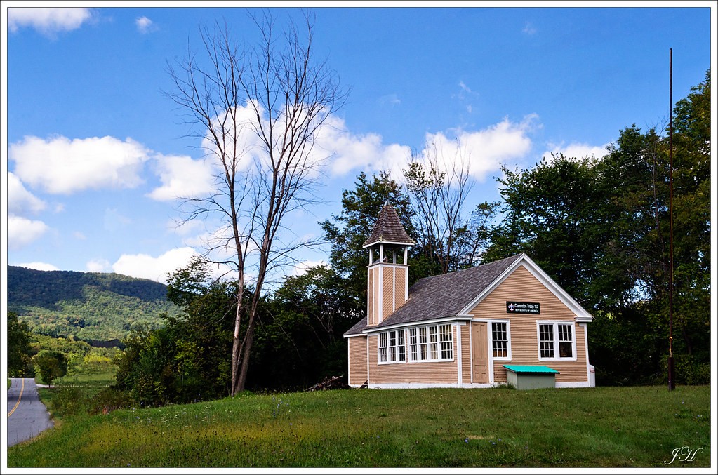
This is of a Boy Scout house thats ~20 minutes from where I live. Now I can't tell from the pic if the building is on a slant, which I guess is possible since it is old, or is my lense messed this one all up. When putting up guides I notice that the vertical lines don't line up. Am I crazy? This is the basic 18-55 lense >.<

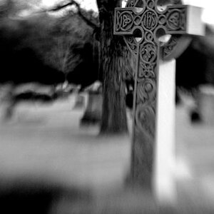
Also did a B&W conversion which I guess you could say is oddball. I wanted to darken the sky and land out to make the building pop. I think it came out pretty good, but it looks like I have a lot of artifactsin the sky. At least I think that's what you call them... the splotchy marks :p

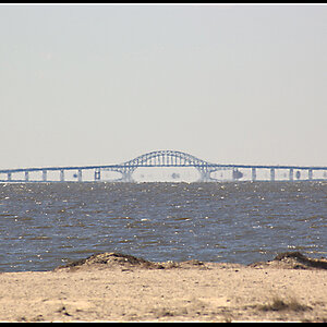
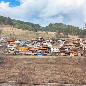
f/22 1/15s ISO 200 @ 26mm. Probably should have got away from that F22 to make the mountains in the background fade a little

6151288331_0276f19789_b.jpg


6151836104_9b6ff878f3_b.jpg
 
The curve of the hill and the mountain is throwing you off, rotate it like 10 degrees CW and you'll be set.

**edit: I take that back, the building is not level! I just tried to straighten it, and when the lines were correct, the building was still at an angle. So, in that case, the composition is fine

**edit#2: It may be that the pole is not straight.... not exactly sure tbh. Sneaky boyscout architects


#1 kind of a boring composition, the focus is the building but my eye is brought down the road and to the left of the picture

#2 don't really like the conversion.. doesn't look realistic as a B&W (if that is what you were going for)
 
Last edited:
yeah no idea. I'll have to go back and look at this place, maybe it's about to fall over lol.

As for the BW, I wasn't really going for realism, I was actually thinking more abstract, the whole burnt sky which I've seen other places.
 
I do not like the mismatched sky tones. IMO the darkest sky tone is a bit too dark. You can also see some noise in it. This often happens when you push to the extremes when processing. So as a B&W, its not really working for me. I think with a little work, the color has more potential.
 
I don't like your black and white conversion at all. There's too much contrast between the blue sky and the white clouds, the trees are solid black, and the whole image is a bit too dark. I took the liberty of doing an edit to balance things out a bit. I used the Black & White adjustment in Photoshop to tweak each color channel individually. Ignore the fact that it's a little over-sharpened, I did that and forgot to undo it.

oh6PR.jpg

I had a version like this but to me it just seems kind of bleh. Yeah it is more realistic, but I don't think the building stands out well. maybe it's just the image itself which is completely possible. In your version I do see in the sky where I tried to clone out phone wires, guess I'm not a good cloner lol

O yeah, I went by this place today and the walls do slant inward >.<
 
Last edited:
I had a version like this but to me it just seems kind of bleh.

Thats why I don't think its really an image that benefits from being turned to monochrome. If you simply want a black and white image, then there a million ways this one could be tweaked, but at the end of the day I don't think it is going to really be adding much to it.
 
What would you say the color version needs? I'm thinking to either clone or crop out the road, other than that I'm not sure. I think this is where my images are lacking, I really never have a set direction when I get into post. I pretty much just experiment until I find something that I think is "good enough" but I rarely wow myself.
 
I would clone out the pole and the road ( you kinda clipped that tree a bit too at the top ) Then I would use curves and some masking on the foreground to adjust everything a little. That treeline is very dark.he You could also select the greens/yellow using Color Range Tool and then apply a saturation layer to them and tweak the luminosity and hue a little. I would also use a masked saturation layer to remove the blue haze in distant mountains. That should get you started.As for the black and white, I am sure you could adjust it so that you were happy with it , but I just feel that if you have to try that hard, than its probably not the best candidate for the treatment to begin with. Maybe that's just me.
 
I'll chop away at this sometime over the weekend and see what I can come up with. thanks!
 

Most reactions

Back
Top