C&C please? (5 pics) =]

abnormalreply

TPF Noob!
Joined
May 1, 2010
Messages
91
Reaction score
0
Location
New York, NY
Can others edit my Photos
Photos NOT OK to edit
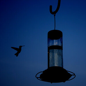
What do you guys think?

2je9zdx.jpg

1/5

2s9dsaw.jpg

2/5

icoe1e.jpg

3/5

jhyft3.jpg

4/5

24h20.jpg

5/5
 
#1
I love the contrast between the red and yellow. Looks good. Maybe if you could get rid of that tree in the upper left though.
#2
I like it. It looks like you took it to the back of the statue though. Maybe if the statue was facing you.
#3
I dont like it how it is. I think it would be alot better if you cropped out alot of the sky.
#4
I like it.
#5
Doesnt really do anything for me.
 
Last edited:
1) I like the colors; you might want to crop the tiny little bit of sky out of the top left, so all you have is building... I dunno. I don't have much else to say on this one.

2) The statue on top seems really bright and saturated compared to the rest of the scene - was this from PP? If so, it might be a bit overdone.

3) Agree with Bus_Rider that there's too much sky. Crank up the contrast so the clouds look a little more interesting, and it might help, but a crop would probably be best.

4) Seen this shot a million times, to be honest, but you can't not take it if you're there. :)

5) I like the idea you were going for here, but I'm not sure it works. The cable ends up being so large in frame that it's just kind of distracting, especially since it's out of focus.

Good pics, I need to take another trip out to NY sometime. :greenpbl:
 
I like one. two, and four but three would be a great image if their was less sky. As it stands it's not dramatic, but if you take out the acres of sky, I believe it would be one somebody would hang in three pictures on a wall somewhere. If that makes sense...
 
Not to be rude, but you live in NY, and the best you got is some tourist shots. Surely there's more to be seen than the usual. And who bumps their own post after 30 min.
 
I definitely plan on getting more than just tourist shots. Haven't done much city-type shoots yet, so I figure I should ease into it starting with the basic stuff.

Yeah, the bump was a bit hasty, but I'm heading to bed and the thread won't be on the front page by tomorrow, so I'd rather get the most out of a new thread that hasn't really died yet than bring back to life an old thread.
 
1. Doesnt do much for me... the angle and being to busy for my liking. However, get rid of the tree on the left that snuck into the shot... and itll be *better*
2. really... centered. The architecture is amazing though... you did a good job catching that.
3. Way to much sky.. Crop some of the top of maybe? I do like this shot... But, the longer im looking at it due to the contrast levels seeming so high, i wonder if this would look good taken further into a silhouette?...
4. Love the Bridge, the background (cityscape) and the lines, and composition.:thumbup:
5. Eh.:thumbdown: Sorry.
 
i like #3 i would lighten up the buildings a bit and burn the sky out a bit to give it that stormy look :) also crop a little more of the sky out overwelms the image a bit, my eyes seem to drift from the subject to the sky pretty quickly.
 
#1- Like this one, the colors are pretty, and I'm not going to say about the tree since everyone else has :D
#2- It's very detailed but with the bottom of the building cut off, it's a bit distracting, and takes away from the picture, IMHO
#3- Beautiful! But yep I agree, too much sky. Was there something on the bottom by the buildings you were avoiding in this shot?
#4- I really really like :) Could you provide the EXIF for this shot?
#5- Wete you trying to focus on the rope to the left? This one really doesn't say much.

I think they're great for practice :) I would try and work on centering a really looking around while looking through the view finder...(Ex.."is there too much sky?") etc.
 
1- I know everyone's complaining about the tree, but I still kinda like that it's there. Maybe I'm wrong; I dunno.

2- I did take one with the bottom not so cut off, but with that one, I'll lose the detail and symmetry of the one that I posted. http://i34.tinypic.com/9ivchv.jpg This is the other one. I don't like it much, and it's pretty difficult to get a different vantage point.

3- Yeah, there were other stuff in the bottom that would've ruined the picture if I left them in. I agree though; too much sky.

4- f/8, 1/400 sec. ISO 100 + slight PP on contrast and saturation

5- I took two pictures. One of the rope in focus, one of everything but the rope in focus. I now realize that I probably should've taken one with everything including the rope in focus. Next time! =]
 

Most reactions

New Topics

Back
Top