lepierce3
TPF Noob!
- Joined
- Oct 6, 2011
- Messages
- 50
- Reaction score
- 3
- Location
- Texas
- Can others edit my Photos
- Photos OK to edit
Hi all  I recently did a session with my sister and her boyfriend for some practice, and they seemed nice and bright on my camera screen (I know, not the best way to tell buut they looked better than anything I've done before, so I was pretty excited), but when I uploaded them on my computer I was disappointed. They didn't look exposed correctly (even though I thought the histograms on some looked about right), and they were dark. Well I killed my computer with photoshop so I used some of the schools computers for the first time, and the photo's looked SO much better! I am pretty sure that those screens are calibrated, while I know that mine is not. I have not edited these at all yet, so that will probably make them a little better, but I just wanted to know which computer was showing the colors better before I went too far...
-So mainly what I wanted to know on these was if the exposure and colors were good (aside from having too much red)
-Also, if the sharpness was ok.
And also any general C+C. I do feel like these are the best I've done yet, which is exciting, but I still need to get a whole lot better, so anything helps! Thank you!
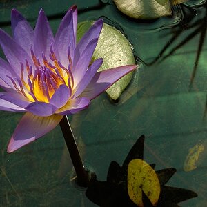
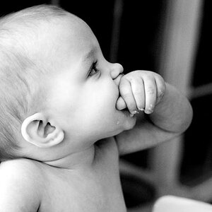
1.

2.

3. Ignore the bottle and tire in this one, I plan to photoshop it out.

I recently did a session with my sister and her boyfriend for some practice, and they seemed nice and bright on my camera screen (I know, not the best way to tell buut they looked better than anything I've done before, so I was pretty excited), but when I uploaded them on my computer I was disappointed. They didn't look exposed correctly (even though I thought the histograms on some looked about right), and they were dark. Well I killed my computer with photoshop so I used some of the schools computers for the first time, and the photo's looked SO much better! I am pretty sure that those screens are calibrated, while I know that mine is not. I have not edited these at all yet, so that will probably make them a little better, but I just wanted to know which computer was showing the colors better before I went too far...-So mainly what I wanted to know on these was if the exposure and colors were good (aside from having too much red)
-Also, if the sharpness was ok.
And also any general C+C. I do feel like these are the best I've done yet, which is exciting, but I still need to get a whole lot better, so anything helps! Thank you!
1.
2.
3. Ignore the bottle and tire in this one, I plan to photoshop it out.


![[No title]](/data/xfmg/thumbnail/37/37138-63809b91a8061d61d48c541f18a69861.jpg?1619737885)
![[No title]](/data/xfmg/thumbnail/34/34069-7b423c5bb5d324f4d924cf839cc122b3.jpg?1619736265)
![[No title]](/data/xfmg/thumbnail/31/31977-2b717e032201241cbeae8226af23eba4.jpg?1619735136)