Flybird
TPF Noob!
- Joined
- Mar 31, 2009
- Messages
- 5
- Reaction score
- 0
- Can others edit my Photos
- Photos NOT OK to edit
Hello! I'm looking for some C&C on some of my recent pictures... I'm not posting them so here are the links:
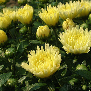
Flower
Strawberry
Blueberry
Black and White
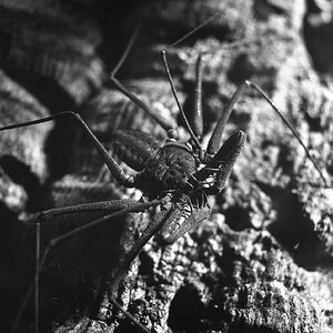
ZOMBIE
Sooooo?
Flower
Strawberry
Blueberry
Black and White
ZOMBIE
Sooooo?


![[No title]](/data/xfmg/thumbnail/36/36301-27972c0474532c2ef657014362950733.jpg?1619737495)
![[No title]](/data/xfmg/thumbnail/40/40296-1e3931509698e96fed6a0e43f5cb4adc.jpg?1619739411)
![[No title]](/data/xfmg/thumbnail/40/40294-85063966547e41d91fa4fcc007f0896c.jpg?1619739410)