C&C PLEASE on Self Portrait!!

Skhigh

TPF Noob!
Joined
Apr 5, 2012
Messages
119
Reaction score
16
Location
Nashville
Website
www.facebook.com
Can others edit my Photos
Photos OK to edit
$1a.jpg

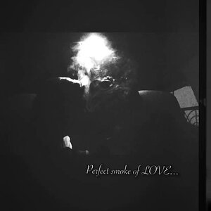
As much as I hate taking self portraits, I really think this one turned out nice. Any suggestions??
 
I have never offered critique and do not really trust my ability to do so.... that being said, I think the image could be cropped closer, too much negative space... take it with a grain of salt...I am working on cropping issues myself :)
 
I appreciate your honesty!! I do agree with you that there is a lot of neg space...but maybe I should have added the other photo...this was taken for my business class and I actually have my logo in the top left corner so its not all white.
 
As a marketing tool I appreciate the amount of dead space. Regardless, I do think it's cropped too tightly on the right. It's cropped so that it looks like you're leaning against the edge of the frame rather than against the wall behind you (there's that tantalizing hint of shadow on the wall) that gives it a cramped feel despite all the dead space. I'm also not a fan of the little bit of bare skin on your arm remaining in this crop. I think you would be better off showing more of the arm, or possibly cropping some off the bottom so that you only show sleeve.

Besides the cropping, I like this. Your lighting looks well done, enough shadow to give your face some dimension without being distracting or obscuring. The bare skin on your chest is brighter than your face (generally a no-no), but with the brilliant white of the dead space my eye is drawn to your face rather than your chest. And I really like the processing - very desaturated, but just that hint of color remaining. Well done!
 
2 things jump at me, one, as mentioned the surface your resting on the right is too pronounced, almost as if you're laying on it. Two, the amount of empty white space in the upper left 1/3.
 
OP, you sure are a good looker, so zoom in on that pretty face of yours next time and market it. And lets see some color too.:thumbup:
 
$1.jpg$1b.jpg
here is the original and the "final" project. I do like the blown out look, and i do agree that the wall looks funny..unfortunately this is the only picture of my face that i liked and it had just that small amount of wall in it...I did crop it out cuz I thought it looked funny...would it be better to leave in? I hate taking pics of myself...thats why I love being the photographer...lol
 
I should add that though I have made excuses I am taking all the CC and making mental notes..... thanks everyone for your input!! Much appreciated!
 
Of the two, I agree with you that I prefer the mono, the color version is all too yellow. Good effort overall.:thumbup:
 
Be happy and put a natural smile in there, that one was forced...but I didn't have to tell you that. ;-)
 
Those big horizontal stripes on your top bother me. Actually, the top bothers me. It might be cute and flattering in person, but here it just appears frumpy or something. God, that sounds awful. I'm sorry. Maybe it's the angle and the way you're twisting to face the camera. It looks like you're straining - physically and emotionally. If you weren't so damn cute I probably wouldn't notice any of this, but I think you can do far better.
 
I hate self portraits, too. They are incredibly difficult to take (even with a remote) and to judge with a neutral eye.

I'm afraid I agree with Jaemie, that top combined with the pose doesn't flatter you. The face is fine, lovely in fact, but in this pose and on first impression the top looks a bit ... (how can I say this?) ... a bit like a maternity top. It gives the impression that you are larger around the middle than a careful study reveals. I'm not saying it's a bad self portrait but I suspect it doesn't do you full justice. You have a face that could launch a thousand ships; why settle for only launching 750? :)
 
You have yourself positioned way too far over to the right side of the frame and you clipped yourself some. You need a little bit of space from the edge. Not much but more then you have here. It does look a bit better with the logo since if fills some of the dead space.
 

Most reactions

New Topics

Back
Top