C&C please

zeppman

TPF Noob!
Joined
Sep 2, 2009
Messages
39
Reaction score
0
Location
Chicago
Can others edit my Photos
Photos OK to edit
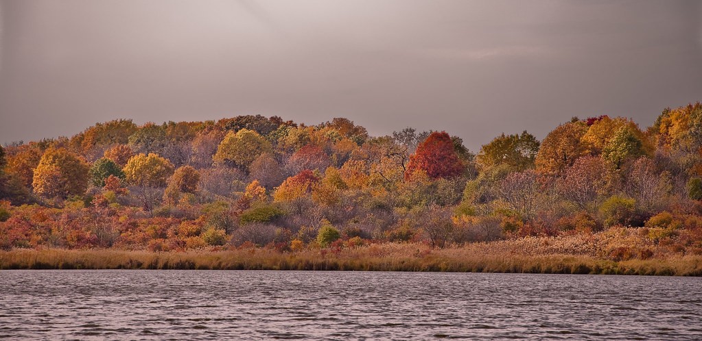
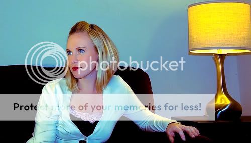
Just looking for some comments, and how I could improve these two images. I'm fairly happy with the landscape shot, but the portrait is lacking... I know. There is also something funny going on with her hair.. too much noise? Thanks.

4039294989_b1227b9dd2_b.jpg


4040006298_91154ce5de.jpg
 
#1 looks purple, and not all that interesting.
#2 why is it green? Intentional or a WB failure? It would look more interesting if she was looking at us or at a subject of interest. Usually if someone is framed to one side of the shot, you want them looking into the photograph (in this case, towards the lamp) or at you, so there is a connection between them and the viewer.
 
Yes, I intentionally colored the portrait like that. Just having fun with lightroom. Is there anything I could do to the landscape shot that could improve it in post processing?

Thanks for your comments.
 
Yes, I intentionally colored the portrait like that. Just having fun with lightroom. Is there anything I could do to the landscape shot that could improve it in post processing?

Thanks for your comments.

Just my personal opinion, but the colors on that portrait are absolutely horrible. Hard to look at really and it really just comes accross as you not understanding how to set the white balance.

Similar issues with the landscape. It has a major color cast over the entire image and the sky and water look really bland. The subject matter isn't that interesting either...just a flat piece of shore with some trees. You also have some really weird detail issues with the trees. I don't know what it is, but the texture in the trees looks really odd.
 
Ok, I don't have the originals on this computer, but tonight I'll go back and try over again. I guess I missed the mark on processing. Thanks.


... I'm almost embarrassed to have posted these now :meh:
 
Last edited:
don't be embarrassed... the more feedback you get, the faster you can improve...

i only started on this forum a cpl months ago, and posted a bunch of crap that ppl said sucked... but it really helped me... cuz...

now... i still post a lot of crap... but it is at least semi-sharp, composed better, has a straight horizon.

it's all relative!

another pointer on the landscape... even though i realize that your subject was "the landscape" it still helps to have a "subject" or "focal point"... in your case... it can be the landscape... but maybe the lone red tree in a see of yellow/green can be your focal point... it's up to you to figure out how to frame it and shoot it so we see that...
 
Ok, I don't have the originals on this computer, but tonight I'll go back and try over again. I guess I missed the mark on processing. Thanks.


... I'm almost embarrassed to have posted these now :meh:

Hey, I know how you feel and have been in the same boat. Processing is an art to try and master just as much as photography.

Here is what a simple levels adjustment did to your portrait. Mad it much better in my opinion. I agree about the posing with having her look at an object, but even still, I don't find it too bad. With the color corrected, I can comment a little better.

4040006298_91154ce5de.jpg


I really like how there seems to be light coming from the direction she is looking while still having the lamp lit on her other side.

There is still a little blue cast in areas although her skin tone is correct in this edit. You might be able to get everything closer by editing the original.
 
C&C per req:

The obvious flaws have already been pointed out, but there's always something that can be learned from an image, and / or done to improve it.

1. The chief failing here is that there is no main subject in the image; the foliage is a great backdrop and if you had an animal on the foreshore, or a boat on the water, you'd have what you needed. Since youd didn't have any of those things, what could we have done? Well, using a CPOL would have removed much of the reflection from the water and made it a little less 'dull'. It would have also increased saturation in the foliage and made it somewhat more pleasing. You could also have used a graduated ND filter to enhance the detail in the sky.

2. This has the potential to be a REALLY nice portrait. Get rid of the seasick-green cast (I understand playing with software to see what happens, but posting the results for critique is less than ideal), crop the out the lamp and tweak the levels/curves to optimize exposure. Since I'm sure this one can be re-shot, I would look for a more suitable background, and pose the subject so that she is looking toward, not necessarily directly at, but at least toward the camera.

Just my $00.02 worth - your mileage may vary.

~John
 
Thanks everyone.

NateS, that looks 1000 times better, would it be possible to briefly explained what you did there? Just correct the white balance?
 
Thanks everyone.

NateS, that looks 1000 times better, would it be possible to briefly explained what you did there? Just correct the white balance?

Yes and no. I corrected the white balance, but I did it by adjusting the curves for each of the three colors seperately. I used gimp but it would be the same in photoshop (or whatever you use).

Just open the "Levels" tool. Then go to the red channel. Pull the far right slider toward the left until you get to the area where it the channel starts to climb (base of the mountain). Then go to the green channel and do the same, then the same on the blue channel.

Then look at the image and if there is still a color cast, go to the color that there is a cast and move is back toward the right slightly until the color cast is gone.

This will take you about 30 seconds to do once you get the hang of it and it's a really good way to get rid of a color cast.
 
Thanks Nate, I use lightroom2. I'll check that out when I get home from work.

On a side note, it goes without saying that I would benefit from taking a photography class, or picking up a book somewhere. I understand how to use my camera (although not mastered). I think I need more improvement as far as composition and choice of lighting goes...

Anyone know of a good course in Chicago? Anyone recommend a good book I could pick up in the mean time that would fit my needs?

Thanks again for everyone's comments.

I have never taken a photography course and many great photogs on here and other forums are the same. I'm not saying that you won't benefit from a course, but you can benefit possibly as much by doing your own research.

A really popular book is "Understanding Exposure". It is highly recommended by just about anybody and everybody. I have never read it (didn't know about it when I started), but I learned a lot of my stuff from online tutorials and online articles explaining different aspects of photography....then going on and trying/practicing those new settings.

I think if I were you, I'd start off by ordering a copy of Understanding Exposure and practicing while you read it....then see where you are at after that and whether you want to do a photography course.
 
I would much prefer having 10 replies telling me what I did wrong, what is bad with them, that they suck and how to improve that to have 10 replies where people just say "nice job".

Keep on shooting and posting, its the best way to learn! I've been smacked down a few times on this site and it was a great kick in the ass.
 
You can also use Curves ( not sure if lightroom has it ) In curves there are three buttons one for black one for gray and one for white. If you know a spot in your pic that is supposed to be white or that is complete black shadow, you can use these buttons to click on those and everything else is adjusted to follow suit. Its a very easy and quick way to get rid of a color cast ( doesn't always work though and you may need to do more in depth adjustment )
 

Most reactions

New Topics

Back
Top