C&C Please?

Nolan

TPF Noob!
Joined
Jun 2, 2009
Messages
246
Reaction score
0
Location
Toronto
Can others edit my Photos
Photos NOT OK to edit
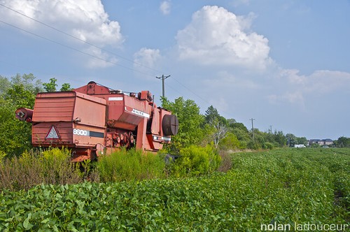
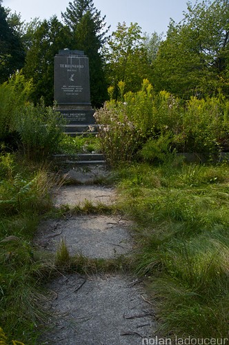
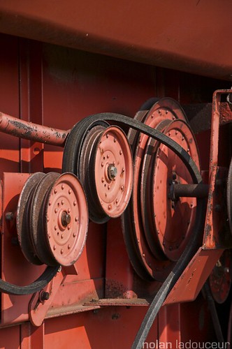
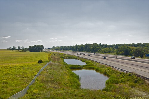
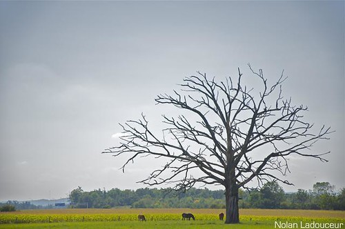
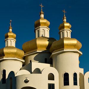
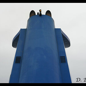
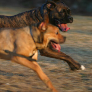
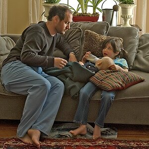
Over the past few days I have been avidly using my D90 and trekking the northern rural parts of my town. What you see below are my favorite shots that I took then. I'd love to get an opinion on them and some C&C!

1)
4946120625_151fce03d8.jpg

2)
4946709330_a0a7ce6697.jpg

3)
4946708822_00424d5961.jpg

4)
4942199424_628e051afa.jpg

5)
4939499527_8eb4b5597a.jpg

6)
4939496063_289a7300b3.jpg
 
5 is the best pic in my opinion. Unlike many of your other photos, the horizon is not centered. The rule of thirds seems to be implemented well. including the horses in the picture was very important, because without them we would have no perspective on the huge size of that tree.

1/2 seems like they would have been better if you had moved closer to the subjects. Because the extra fluff on the sides does not really add to the picture much.

3 is interesting, although it is fine the way it is, I may have tried to shoot from directly behind the wheels that the belt rides on, to make the lines of them more prevalent in the picture.

4 is just not a very interesting picture in my opinion, sorry

6- With this picture, I like where the line starts, but I may suggest trying to stand at an angle that would not make the fence stop right in the center of the photo. Consider shooting from a lower perspective, or shooting the tree through the fence might provide an interesting idea...
 
C&C

1. Slightly over-eposed and in need of a bit of a saturation boost.

2. Not perhaps the most interesting of tombstones, but very good use of the sidewalk to create a leading line and draw the eye in.

3. I rather like this; again I think it could use some saturation and I'd consider perhaps a slight levels/curves adjustment to reduce the dynamic range a little.

4. Yep that's a highway.

5. I think this one might have ben better cropped to a vertical or even square composition; the empty space image right isn't really addding anything to the image.

6. An interesting dichotomy; the fence divides the wild from the civilized or something like that.

Overall some nice images; a couple of general comments. Almost all of your images are at least slightly over-exposed, due mainly to fairly bright skies. If you're going to improve, and want to continue this sort of shooting, I would strongly recommend the purchase of graduated neutral density filters to enhance your sky and reduce the broad dynamic range with which you're dealing. As well, a polarizing filter would go a long way to increasing saturation, contrast and generally producing stronger images. Oh and by the way, your location says 'Toronto' - there's no rural until you hit the Manitoba border, who are you trying to kid???

Just my $00.02 worth - your mileage may vary.

~John
 
I like #3 and #5, but im just a beginner so I really don't have any constructive criticism other than...
Go back to the location in #5 when the clouds look more interesting and there's more dramatic lighting. Then it would be AWESOME!!!
 
Thanks for input on 1-6, I'll consider it when I reedit some of these shots or go back out shooting.

So it looks #4 is just stupid eh. Hahah I can understand, now that you guys point it out. Pshhh its just a highway and some farm land. Next time I go out shooting, no more generic junk.

I like #3 and #5, but im just a beginner so I really don't have any constructive criticism other than...
Go back to the location in #5 when the clouds look more interesting and there's more dramatic lighting. Then it would be AWESOME!!!

Funny that you mentioned that "owlxxx"... thats what I hoped the weather would be like that day I took #5. I was planning for it to look like this (look below), however with a bit darker and more ominous clouds.
25805016.jpg

Note this is image isn't mine, found it on google earth.
 
Last edited:

Most reactions

Back
Top