camz
No longer a newbie, moving up!
- Joined
- Jun 11, 2009
- Messages
- 1,878
- Reaction score
- 285
- Location
- Bay Area
- Can others edit my Photos
- Photos NOT OK to edit
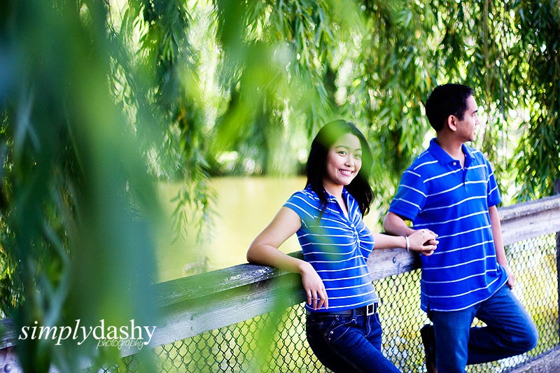
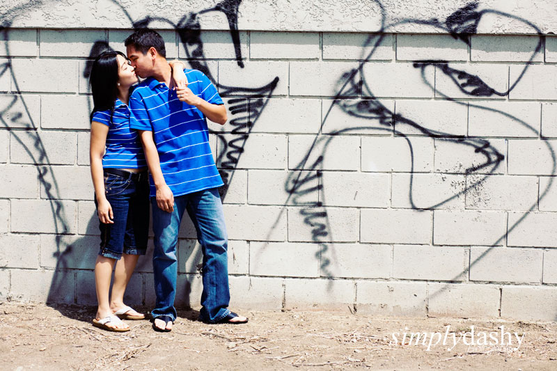
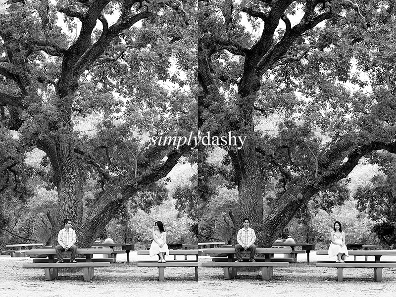
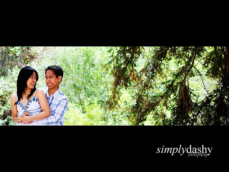
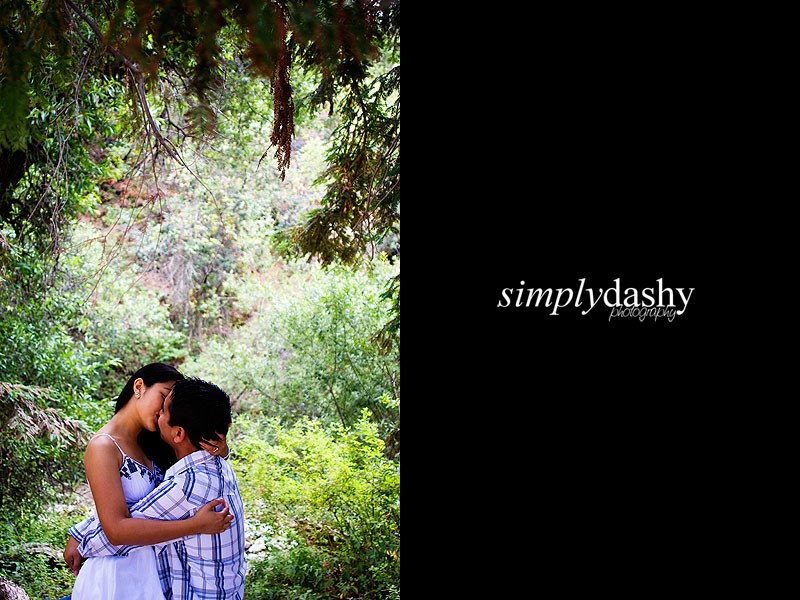
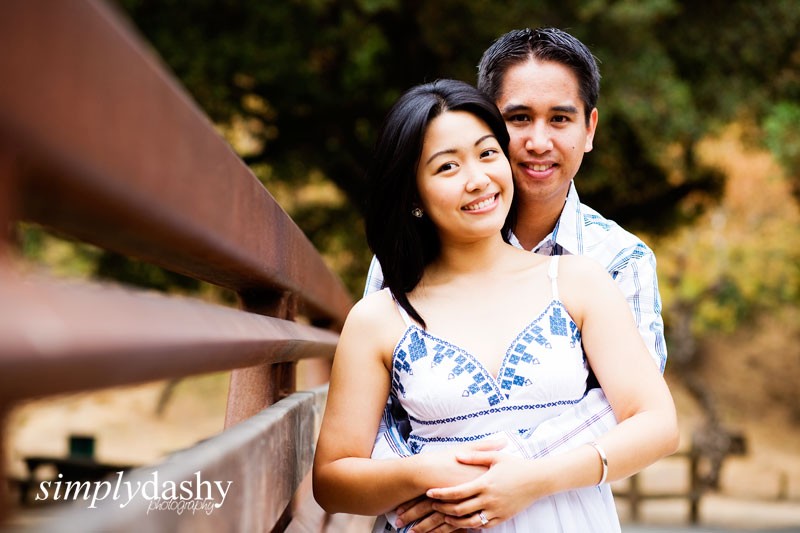
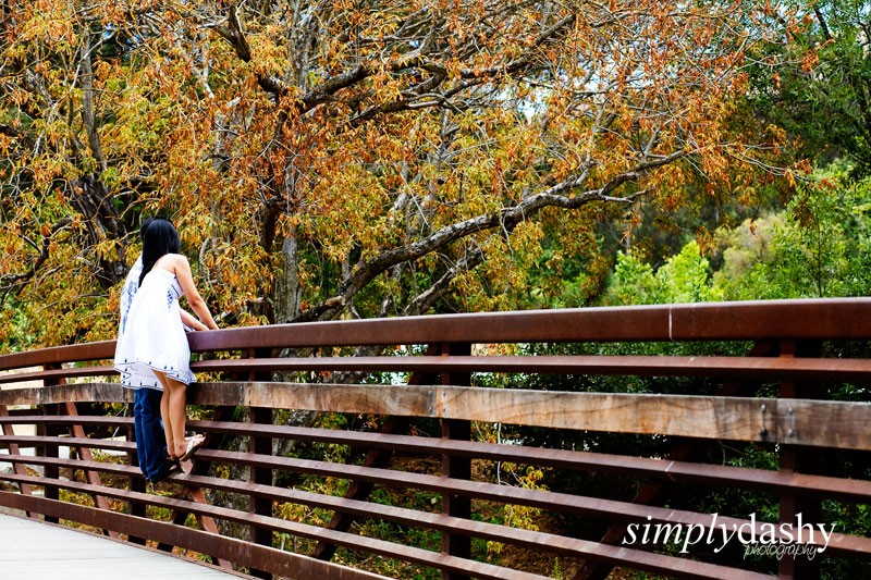
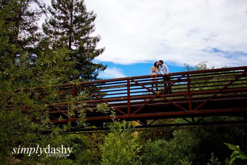
Here's an E-session we did over the weekend and your opinions are a must. ")
1

2
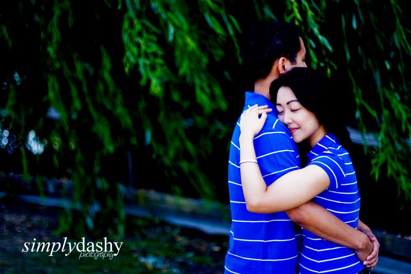
3
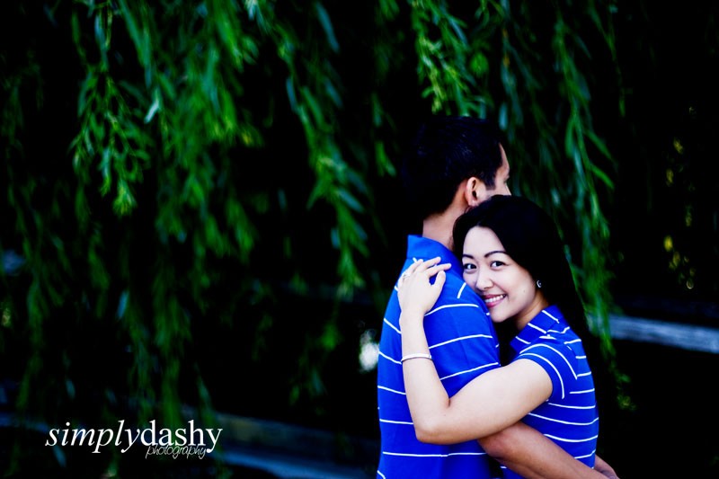
4
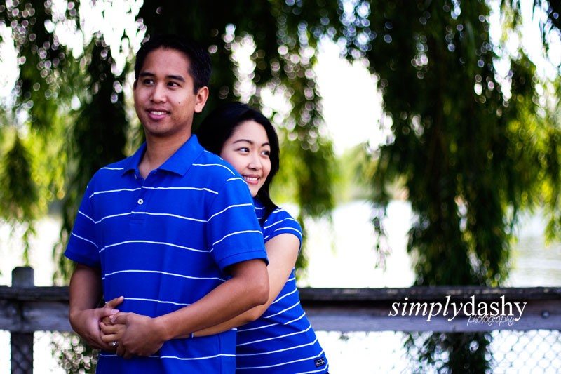
5
6
7

8

9
10
11
12
13
14
Thanks for viewing!
Camz
Simply Dashy Photography
1
2
3
4
5
6
7
8
9
10
11
12
13
14
Thanks for viewing!
Camz
Simply Dashy Photography

![[No title]](/data/xfmg/thumbnail/39/39473-02c5070f4f13c145d9e4e3f13d9eec0f.jpg?1619739043)

![[No title]](/data/xfmg/thumbnail/33/33031-909b1e1ff8739eef165c60b70c9a6a38.jpg?1619735845)
![[No title]](/data/xfmg/thumbnail/33/33029-f4556b4c89cecbad12ebe6b782a51ef5.jpg?1619735843)

![[No title]](/data/xfmg/thumbnail/35/35587-16c570d2927f2a9ea1945320686eca01.jpg?1619737062)