C&C some recent images?

rodnunley

TPF Noob!
Joined
Sep 7, 2010
Messages
81
Reaction score
1
Location
Austin, TX
Website
www.flickr.com
Can others edit my Photos
Photos OK to edit
I am new to the board and I am picking up that C&C stands for Critique and ... um ... something.

Anyway, I would love to get some feedback on some of my recent images. I like some more than others and would love to know what I can do to improve what I am doing.

This is about my third week taking pictures with a DSLR.

I am using a Nikon D5000 with both an 18-55mm and a 55-200 mm lens. These were all hand held or mono pod with no flash. I have a tripod for the next go around and a shutter release on the way.

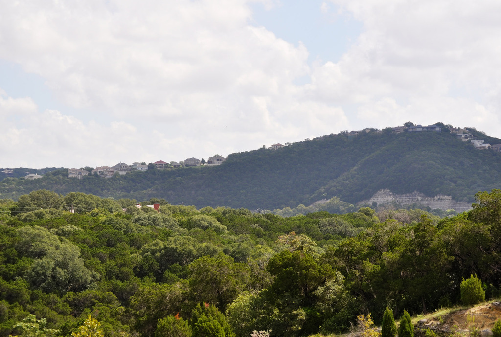
1. An HDR landscape image:

5009418078_67077feec7_b.jpg


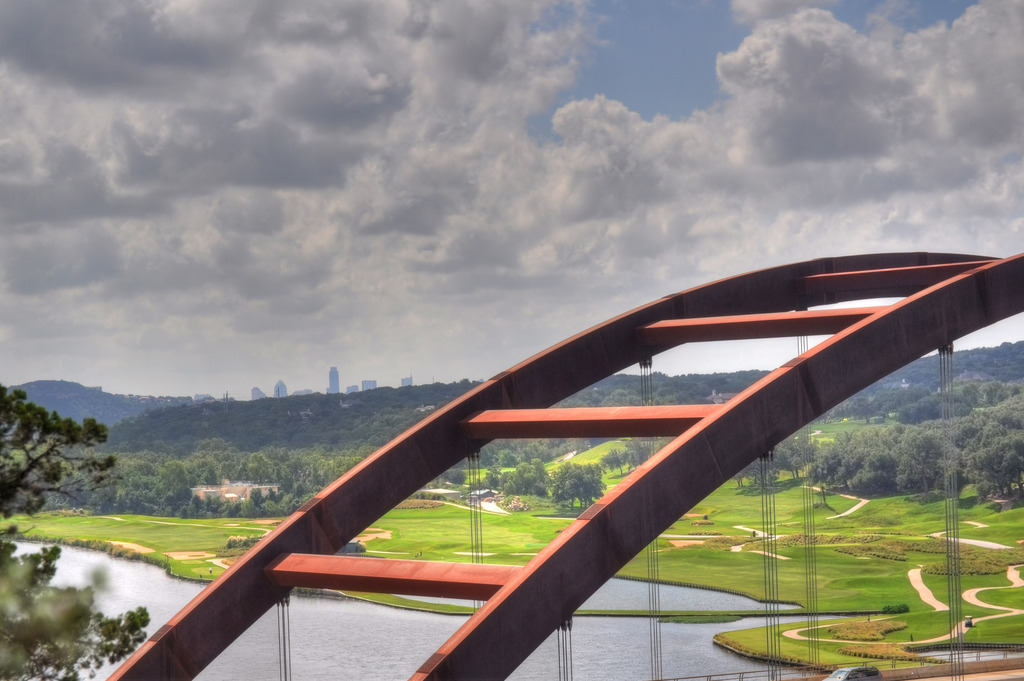
2. An HDR picture of Austin's famous Pennybacker Bridge:

5009416786_2ac1b333fc_b.jpg


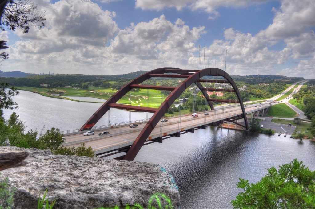
3. Another HDR of the Pennybacker bridge - more classic framing:

5009417590_647d8fd417_b.jpg


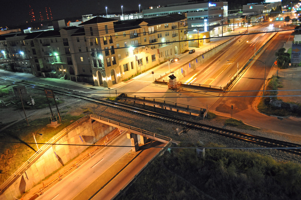
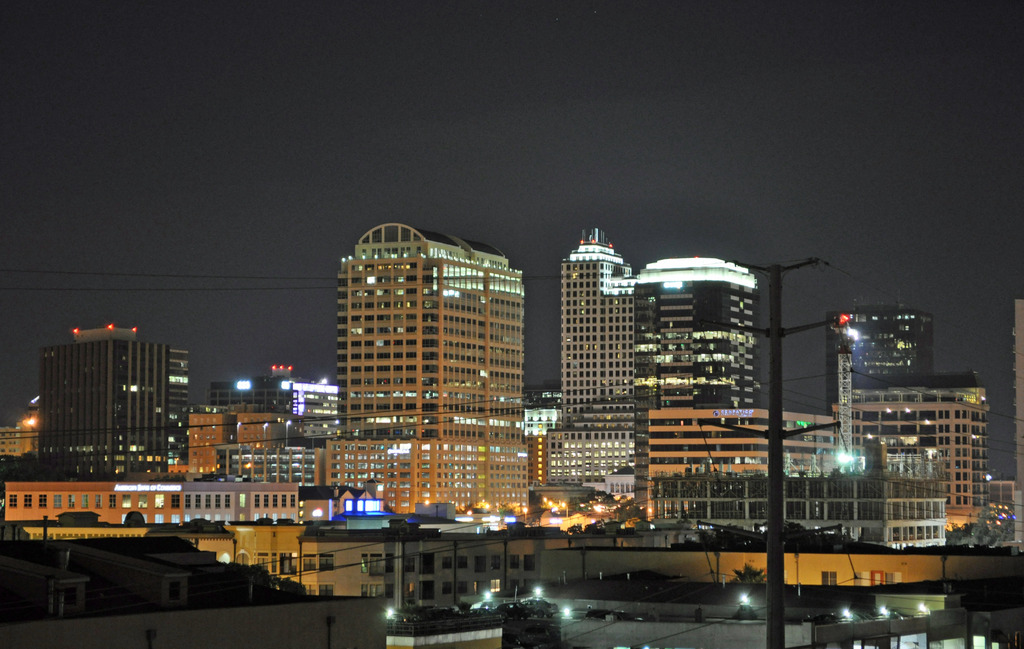
4. Downtown Austin night photography:

5008803485_3287031932_b.jpg


5. A partial Downtown skyline shot:

5008802799_da49704df0_b.jpg


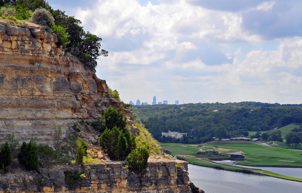
6. A shot of the cliffs, the skyline and the golf course:

5008801539_6e1224fccc_b.jpg


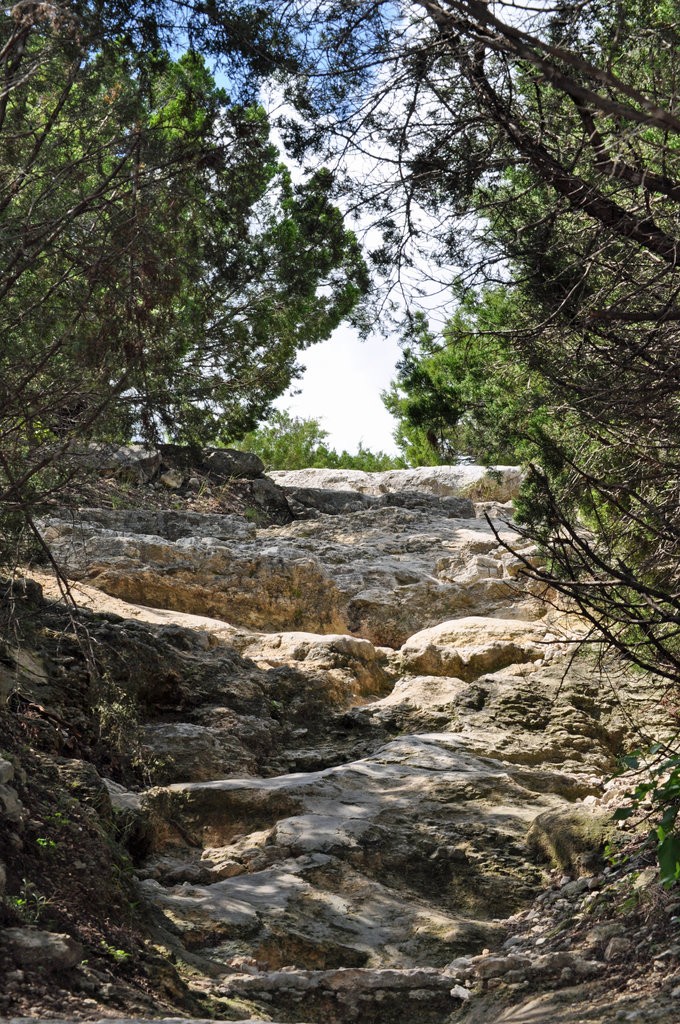
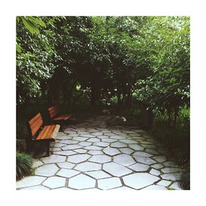
7. The uphill path to the cliffs near the Pennybacker bridge:

5009403398_e456bab07a_b.jpg


Thanks for the feedback and feel free to be brutal. I want to improve and learn what I'm doing right and wrong.
 
Last edited:
ok lets see the first one is a nice photo its always tough for landscape shots because even though its breath taking some people will be like this photo is boring and blah blah blah. on the second one i really love how the bridge guides my eye threw the photo. the third one is alright i probably would have had the bridge kissing the left side of the photo with 4, and 5 the power lines are a little distracting but there isn't much you can do about them... you can try to edit them out but i know my editing skills aren't that good. I really like the last one its really cool how it guides my eye up the rocks and threw the trees
 
C & C = Critique and Comment.

Please number photos if you post more than 3.

#1 has no point of interest, the background is very hazy and the sky lacks pop. Some editing techniques would help the sky, but that's about all.

#2 The leading line of the bridge arch leads the eye from the lower left of the photo, and right out of the photo on the right edge. Most peple will see the golf course cart path, but will not spend much time looking at the downtown skyline or the upper left quadrant of the photo.

In #3 the highway is a good leading line that goes to the bridge. I recommend you crop away the left 1/4, and top 1/4 of the photo.

In #4 the tilted horizon and wires in the foreground kill it for me.

#5 the powerline tower and near foreground could go.

#6 doesn't work at all for me because the background is to far away.

#7 does use the trail well as a leading line but when we get to where it leads our eye, there is nothing there worth seeing.

Posting that many photos will severely limit the number of critiques you will get. If you keep to no more than 2 or 3 you'll get more responses.
 
Thanks. I will number the photos and post fewer per post from now on. I appreciate the feedback Very useful information for me to process.

C & C = Critique and Comment.

Please number photos if you post more than 3.

#1 has no point of interest, the background is very hazy and the sky lacks pop. Some editing techniques would help the sky, but that's about all.

#2 The leading line of the bridge arch leads the eye from the lower left of the photo, and right out of the photo on the right edge. Most peple will see the golf course cart path, but will not spend much time looking at the downtown skyline or the upper left quadrant of the photo.

In #3 the highway is a good leading line that goes to the bridge. I recommend you crop away the left 1/4, and top 1/4 of the photo.

In #4 the tilted horizon and wires in the foreground kill it for me.

#5 the powerline tower and near foreground could go.

#6 doesn't work at all for me because the background is to far away.

#7 does use the trail well as a leading line but when we get to where it leads our eye, there is nothing there worth seeing.

Posting that many photos will severely limit the number of critiques you will get. If you keep to no more than 2 or 3 you'll get more responses.
 
C & C = Critique and Comment.

Please number photos if you post more than 3 . . .

. . . Posting that many photos will severely limit the number of critiques you will get. If you keep to no more than 2 or 3 you'll get more responses.

Agreed. The maximum for me is 5 photos. Numbered and with a blank line between photos.

#1 is a hillside with trees and some really distant houses. I see that all the time in Missouri... Try to find interesting, unique (or uniquely done) subjects.

#2 The tree or whatever on the left hand side is really bugging me. It makes me feel like someone is sticking something in my eye. Otherwise, I find the image pleasing. I like the contrast between the countryside and the the steel bridge.

#3 The sky and bridge look really dull. Unnaturally dull. I don't know if that's because of the HDR or not, but it messes up an otherwise nicely composed shot.

#'s 4&5 Oh no! The city got in the way of your power line picture! Doesn't it seem that any time you find a nice vantage point for an excellent photo, the utilities had to go an muck it up. :(

#6 I would crop some of the bottom off. I think the golf course is just distracting from your subject (the city is your subject, isn't it?)

#7 I'm not a huge fan of the shadows cast by the trees. I know there's not a whole lot you could do... maybe some off camera lighting, perhaps. Or a long exposure near or right after sunset... dunno.

Welcome to the photo forum. You show forethought, which is a big plus. Photography is an art, so creativity is a must. I think you've got it, you just need to look at the little things that are messing you up.

Good work. :thumbup:
 
Those power lines killed me. The train overpass in particular I think could be a great shot without those stupid lines. I will say that I think I want to stay away from digitally removing things from my pictures. I'm fine with tweaking the colors or playing with the curves, but I want what's in the lens to be in the finished picture.

That may make things more challenging for me to get really great pictures.

Thanks for the feedback. :)

C & C = Critique and Comment.

Please number photos if you post more than 3 . . .

. . . Posting that many photos will severely limit the number of critiques you will get. If you keep to no more than 2 or 3 you'll get more responses.

Agreed. The maximum for me is 5 photos. Numbered and with a blank line between photos.

#1 is a hillside with trees and some really distant houses. I see that all the time in Missouri... Try to find interesting, unique (or uniquely done) subjects.

#2 The tree or whatever on the left hand side is really bugging me. It makes me feel like someone is sticking something in my eye. Otherwise, I find the image pleasing. I like the contrast between the countryside and the the steel bridge.

#3 The sky and bridge look really dull. Unnaturally dull. I don't know if that's because of the HDR or not, but it messes up an otherwise nicely composed shot.

#'s 4&5 Oh no! The city got in the way of your power line picture! Doesn't it seem that any time you find a nice vantage point for an excellent photo, the utilities had to go an muck it up. :(

#6 I would crop some of the bottom off. I think the golf course is just distracting from your subject (the city is your subject, isn't it?)

#7 I'm not a huge fan of the shadows cast by the trees. I know there's not a whole lot you could do... maybe some off camera lighting, perhaps. Or a long exposure near or right after sunset... dunno.

Welcome to the photo forum. You show forethought, which is a big plus. Photography is an art, so creativity is a must. I think you've got it, you just need to look at the little things that are messing you up.

Good work. :thumbup:
 
I will say that I think I want to stay away from digitally removing things from my pictures.
Why?

What you captured wasn't reality anyway, in so far as the camera can't record what you see.

I will agree it's worth the effort to try and shoot from a location that minimizes and distractions, but image editing software is just as valuable a tool as is the camera and lens.

As it is the photos you posted looked a bit over saturated, particularly the greens. Also, for lanscape shots you should consider pre-processing your photos, by using a good circular polarizing filter and a graduated neutral density filter when you have a reasonably level horizon.
 
You make a fair point. I just don't want to remove from reality. I like the idea of bending what you see without removing what was there. If that makes any sense.

Again, I'm new at this so my opinion certainly may change the more I take pictures. But for now I feel like making the right composition choices is important for me to become a better photographer.

Once I have the fundamentals of composition and technique in the camera are more important than just being able to remove a rock I don't like or a tree that is in the way.

As for filters ... I have some on the way. I ordered a few online to play with.

I will say that I think I want to stay away from digitally removing things from my pictures.
Why?

What you captured wasn't reality anyway, in so far as the camera can't record what you see.

I will agree it's worth the effort to try and shoot from a location that minimizes and distractions, but image editing software is just as valuable a tool as is the camera and lens.

As it is the photos you posted looked a bit over saturated, particularly the greens. Also, for lanscape shots you should consider pre-processing your photos, by using a good circular polarizing filter and a graduated neutral density filter when you have a reasonably level horizon.
 
In #3 the highway is a good leading line that goes to the bridge. I recommend you crop away the left 1/4, and top 1/4 of the photo.

Like so?

85564754.png
A bit more I think, to get rid of the grafitti and remove more distracting elements.

In this edit I also sharpened the image, adjusted the mid-tone contrast (clarity) and did a little quick and dirty clone work.

85564754.jpg
 

Most reactions

New Topics

Back
Top