C&C some weekend shots. (please?)

Bitter Jeweler

Been spending a lot of time on here!
Joined
Apr 27, 2009
Messages
12,983
Reaction score
4,993
Location
Cleveland, Ohio
Can others edit my Photos
Photos OK to edit
I have been having fun learning my new camera. I do have a ways to go though. I wanted to share some shots and then listen to advice.

3499881512_62c1e6479e_o.jpg


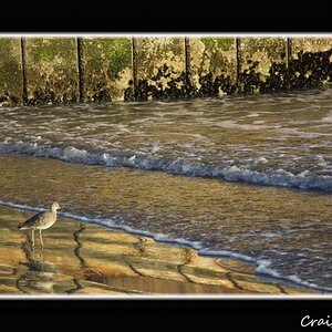
Tv(Shutter Speed): 1/320Sec.
Av(Aperture Value): F20
Metering Modes: Spot
Exposure Compensation: 0
ISO Speed: 400
Lens: EF-S18-55mm f/3.5-5.6 IS
Focal Length
55.0 mm

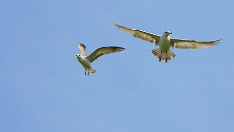
I took about 30 pics of a swarm of seagulls and tried different things, but this was the best I could get, with some sharpening PP. I can't remember what mode I was in AV or TV. I think I switched during the shoot too. What would help in this instance? Should I have upped the ISO to 800 or even 1600? Would a 55mm faster Prime lense help? These birds were swarming around me, maybe 20-25 feet away. What lense, or settings would you advise in this situation to get sharp results?
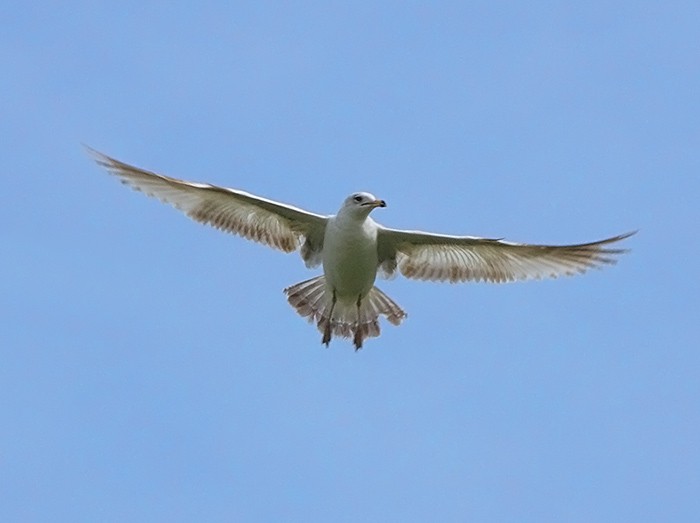
3499066171_fcf8493bef_o.jpg


Tv(Shutter Speed)
1/320Sec.
Av(Aperture Value)
F5.6
Metering Modes
Spot
Exposure Compensation
0
ISO Speed
100
Lens
EF-S18-55mm f/3.5-5.6 IS

This was cropped pretty severly. I know a longer lense would have helped. And maybe had I thought about what ISO I was on too. I have a hard time remembering things to check and quickly change to get the shot. But compositionally, does it work as is, or in a situation like this should I have equal space between the subjects and the borders?

3499882990_e69a2758f6_o.jpg


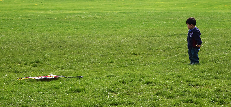
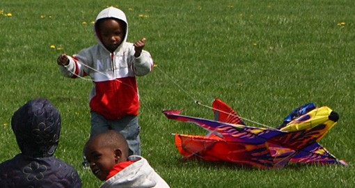
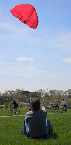
Still with the blurries. :meh: Again, compositionally, would this shot be better cropped wider, with all of the kite in the pic? What about the kite in the foreground?

3499067003_f94148bec0_o.jpg


3495228321_249ba9fee0_o.jpg


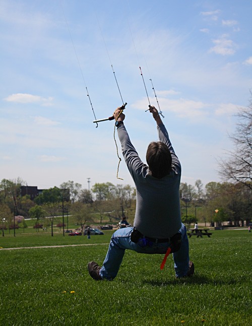
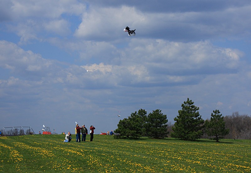
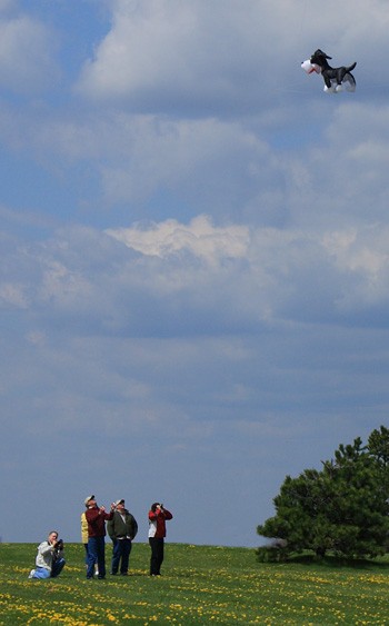
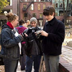
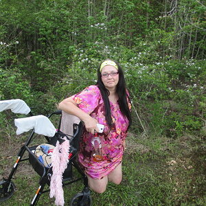
Would this pic (^) be more interesting cropped vertically, framing the people and the dog? I did it this way because the triangle formed by the people, dog, and trees.


3496045302_6f2eeb387d_o.jpg


And of all my recent pics, this is the one (below) I am most proud of. I really like how it got some under lighting, I believe from reflection from a small pond.

3496045378_87d2bf5c7f_o.jpg


I would love some criticism. I don't have anyone around me that can say anything other than "ooh, pretty", if you know what I mean.

I know I posted a lot. I don't expect comments for all of them, maybe just for things that stand out in your mind. Much appreciated.
 
Last edited:
I like the 2 bird photo's but the rest just look like "snap shots" to my un-trained eye.
 
Heh, my eye is untrained too. I appreciate the comment, and I think I know what you mean. Or is it more just the content?
BTW, I grew up in Canton :)

So does cropping the below image help?
3506127940_466f78a6ce_o.jpg
 
Last edited:
Here's my two cents:
1. Boring central composition and dull colors. Push your saturation a bit and frame the bird somewhere other than where it's at.
2. I think this is your strongest shot, but there is too much space in the frame. And it would have helped the shot if you got down lower to help define the boy's height more (maybe incorporate the horizon).
3. Looks like a massive crop was done here but again you have the central placement of your subjects but without the sharpness.
4. In this one, you're missing the key element to the shot, the kite. You have the man's head and the strings all leading the eye to the top of the frame but there is nothing there. Instead we get the parking lot and some trees in the background. And without the kite, the guy just looks odd, like he's floating or shooting at the sky.
5. I understand what you're trying to do here with the psychic line but the primary relationship that you want to highlight here is between the people and the kite. Leave the trees out of it, they have nothing to add to the shot. Shooting this portrait would've helped close in the space around your subjects, and you would want to compose it without the background kites to distract the eye.
6. Central placement, soft focus, and dull colors.
7. This one suffers from the same problem as the guy flying the kite. There is nothing attached to the subject and the strings make the eyes want to relate something to it. A kite flying in the middle of the frame by itself doesn't hold much interest, even with the under lighting. If I were wanting to get a shot like this, I'd take it from the kite flyer's perspective. Frame the arms in leading the lines to the kite creating perspective and forming a relationship between subjects.
 
Heh, my eye is untrained too. I appreciate the comment, and I think I know what you mean. Or is it more just the content?
BTW, I grew up in Canton :)

So does cropping the below image help?
3505985296_0a0cea8b5a_o.jpg

Much better!
 
Here's my two cents:
1. Boring central composition and dull colors. Push your saturation a bit and frame the bird somewhere other than where it's at.
2. I think this is your strongest shot, but there is too much space in the frame. And it would have helped the shot if you got down lower to help define the boy's height more (maybe incorporate the horizon).
3. Looks like a massive crop was done here but again you have the central placement of your subjects but without the sharpness.
4. In this one, you're missing the key element to the shot, the kite. You have the man's head and the strings all leading the eye to the top of the frame but there is nothing there. Instead we get the parking lot and some trees in the background. And without the kite, the guy just looks odd, like he's floating or shooting at the sky.
5. I understand what you're trying to do here with the psychic line but the primary relationship that you want to highlight here is between the people and the kite. Leave the trees out of it, they have nothing to add to the shot. Shooting this portrait would've helped close in the space around your subjects, and you would want to compose it without the background kites to distract the eye.
6. Central placement, soft focus, and dull colors.
7. This one suffers from the same problem as the guy flying the kite. There is nothing attached to the subject and the strings make the eyes want to relate something to it. A kite flying in the middle of the frame by itself doesn't hold much interest, even with the under lighting. If I were wanting to get a shot like this, I'd take it from the kite flyer's perspective. Frame the arms in leading the lines to the kite creating perspective and forming a relationship between subjects.

Thanks Mr. Banks!

To explain why I did what I did. Don't take this as justification or defense. I am just trying to comvey my thought process.

#1 I am always afraid I over do saturation. I struggle with compostion. Centered is all that looked good to me. If I put it off to the top right side, should I make a wider crop to maintain balance with more space below and to the left of the subject? Maybe this?
3505265905_8549caf0ed_o.jpg


#2 If I shot down lower to capture the horizon, I would have the parking lot. Would that detract from the subject? I should learn to move around more when taking pics. I think I am afraid to get too close to people. But with what you point out, getting closer and if I shot more from the left of where I was, I would have closed the gap between the boy and the kite.

#3 Was a massive crop. Again, I need to move in.
Is this crop more exciting (granted still not in focus)?
3505265871_90d4558734_o.jpg
http://farm4.static.flickr.com/3616/3505265871_90d4558734_o.jpg

#4 Thats the most difficult thing to capture, the kite and kite holder. I thought this worked for an action(ish) shot, but yeah, the viewer has no clue what he is doing. But then with the shots below, they don't capture how much pull that kite has. Which is what I trying to convey.

3506021214_33d28bb965_o.jpg
3499066865_966d4d8fff_o.jpg


#5 does the pic I posted a couple posts up work better?
This suffers again from not getting closer to the subjects. I think this point is being driven home.
#6 I see a trend :) that I have to work on.
#7 My only objective with this pic was getting a really good pic of my kite. The kite was staked to the ground so there is no flyer, which would have been me ;). But I understand your point completely.

I appreciate your comments, because if I don't get any, I won't learn.
 
Much better!

I re-edited some more and deleted the image you quoted (sorry). I totally agree with you. I removed all the other people and stuff in the sky and it is much cleaner and IMO more dynamic. And cropped it a little closer still.

I really apreciate you making me think!
 
I appreciate you explaining the thought process to your photos here as it better helps us provide a critique. Your photos here are much better for framing and they create a better understanding for what is going on in the photo. The crop of the kids however, is worse because the more you crop into a photo, the more clarity and sharpness you lose (and this didn't look in focus anyways). You keep going and pretty soon you'll end up with a photo looking like an Atari game. Let your lens or feet do the work so you can keep the clarity of your photos.
 
The crop of the kids however, is worse because the more you crop into a photo, the more clarity and sharpness you lose (and this didn't look in focus anyways).

But is it compositionally better?
 

Most reactions

Back
Top