- Joined
- Oct 16, 2011
- Messages
- 2,616
- Reaction score
- 432
- Location
- 203
- Can others edit my Photos
- Photos OK to edit
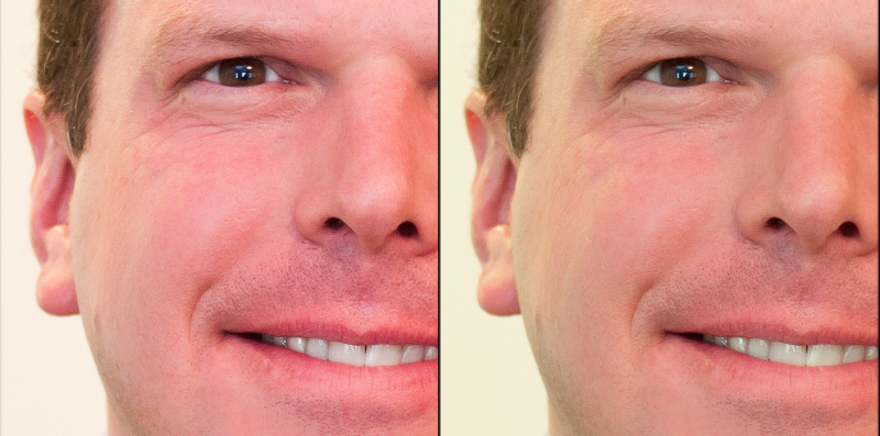
Thanks! I like this much better. I really do not have an eye yet for red tones but it seems that my D90 really tends to oversaturate the red a bit. Thanks for the edit.
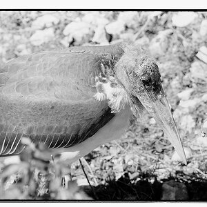
What do you think about the pose?
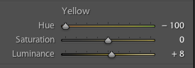
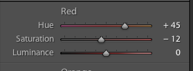
Yours ain't the only one lol. Mine does too. I usually dial some back or in LR I dial down the orange.


")


![[No title]](/data/xfmg/thumbnail/37/37621-b86590cf53fc4001d12701ee3091029b.jpg?1619738152)
![[No title]](/data/xfmg/thumbnail/35/35946-771bfce9b2727c9126587d96c471da80.jpg?1619737254)