JTPhotography
No longer a newbie, moving up!
- Joined
- Dec 8, 2012
- Messages
- 902
- Reaction score
- 428
- Location
- South Mississippi
- Can others edit my Photos
- Photos NOT OK to edit
Follow along with the video below to see how to install our site as a web app on your home screen.

Note: This feature currently requires accessing the site using the built-in Safari browser.
:thumbup::thumbup::thumbup:. I like it.
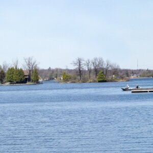
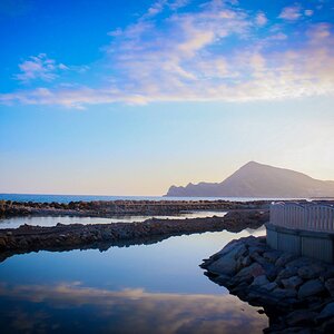
It's your creation and I accept it as it is. Most of the things make sens and execution is lovely, the only thing, which I don't feel 100% about is the water glare spilling over and also intensifying at the left edge. My sight is spilling over with it to. Maybe it should be less intense to channel attention to the center ?
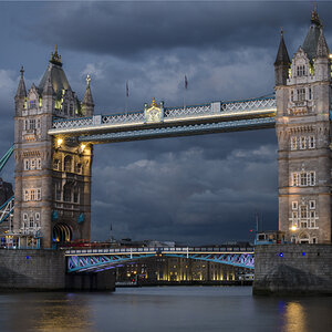
August 2013 - Photo of the Month Nomination
That says it all!!
:thumbup::thumbup::thumbup:. I like it.
It's your creation and I accept it as it is. Most of the things make sens and execution is lovely, the only thing, which I don't feel 100% about is the water glare spilling over and also intensifying at the left edge. My sight is spilling over with it to. Maybe it should be less intense to channel attention to the center ?
Thanks! I agree about the glare, and the funny thing is when I print this image, which I have done so numerous times in both color and BW, the glare isn't very soft and works great to add contrast. I am not sure why that is, I am not that well versed in the technical aspect of color correction and photos being tranfered to print, but I will take it. In both cases, the bright area prints as a grey mid tone that works perfectly. I will post up the color one, which I actuall like better, for comparison.
"Wipping" Mishele is back !August 2013 - Photo of the Month Nomination
That says it all!!
It looks to me like you managed the layout of tones at the largest scale entirely with burning and dodging.
While the picture is very nice, I think a more organized approach to graduating the tones from dark to light and back again would make this one better. Squint and blur it out a bunch, and look at the structure of the light and dark areas. It doesn't take much imagination to see some subtle re-arrangements of those large-scale forms that would pull this together better. The white/glare region spilling off the left side of the frame is just one piece of that puzzle.
Still, it's a very nice rendition of this particular idiom. Well done!