Can't decide which logo i like!! :(

ScubaBrett22

TPF Noob!
Joined
Sep 24, 2010
Messages
118
Reaction score
6
Location
Parkland FL
Website
www.youtube.com
Can others edit my Photos
Photos OK to edit
I have made a logo for my Car group called BBNJ and i can't decide which logo to use and i would like to hear some input besides my close friends!!

I made these all in Photoshop CS5


1. This is our current logo

BBNJLogoHDBLACK3000x2400.jpg


2. This logo i just made 10 min ago it kinda has a Carbon Fiber theme.

BBNJLogoCarbonFiber.jpg


3. Another one i made
BBNJLogo2.jpg


4. Another one i made just with a reflective surface.

BBNJReflective.jpg


So out of these four which one or two do "You" like the most?
 
The first. I think #2 just looks too dark, and I don't like the "BBNJ" font in #3 and #4.
 
The first. I think #2 just looks too dark, and I don't like the "BBNJ" font in #3 and #4.

Ya i agree with what your saying on #3 and #4 they kinda look childish. But for some reason #2 is my favorite cause it has the "Carbon Fiber" texture lol.

The problem is with our group is its called BBNJ (Bernard, Brett, Nathan, Jon) and i am trying other types of things like trying to create a cool looking logo but thats hard since i am only 16 and i don't know everything even though i say i do sometimes lol. :D
 
These all look like they are made to be flashed up as title screens on a video. Have you thought how they are going to look if you need to put them on the of a letter head or mailing envelope with a white background? Make sure you try your logo out both places before resting on a final decision.

Remember to keep it simple, once you find something simple that works for you you can always take that and spice it up as needed for say video applications or such. (like your carbon fiber theme)

If you have the means design the logo in a software app that lets you export as a vector format that way you will not run into resizing issues later on down the line.

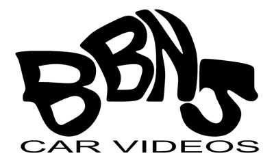
Have you thought of Customizing the letters to form the shape of a car or something along those lines? (Meaning not using a font.) Try drawing freehand first and see what you can come up with. Nothing crazy, just creative. It will catch the eyes of others and keep it harder to copy by not using canned fonts.
 
This is just a quick and dirty example of what I was talking about. Definately needs work and added time from the 10mins I put in to it. Thought maybe it my spark some ideas with you, give you something for you to build on creatively speaking.

bbnj.jpg
 
This is just a quick and dirty example of what I was talking about. Definately needs work and added time from the 10mins I put in to it. Thought maybe it my spark some ideas with you, give you something for you to build on creatively speaking.

bbnj.jpg

Yes you just sparked quite a few ideals in my head thanks!!
 

Most reactions

Back
Top