gizmo2071
TPF Noob!
- Joined
- Oct 19, 2006
- Messages
- 861
- Reaction score
- 0
- Location
- Toronto, ONT
- Website
- www.ummonshadow.com
- Can others edit my Photos
- Photos NOT OK to edit
So let me know what you think.
So todays word:
Captive
cap‧tive  /ˈkæptɪv/ Pronunciation[kap-tiv]
–noun
1. a prisoner.
2. a person who is enslaved or dominated; slave: He is the captive of his own fears.
–adjective
3. made or held prisoner, esp. in war: captive troops.
4. kept in confinement or restraint: captive animals.
5. enslaved by love, beauty, etc.; captivated: her captive beau.

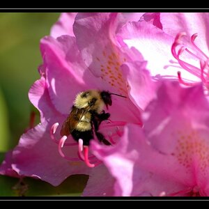
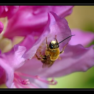
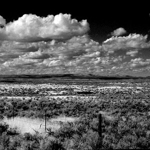
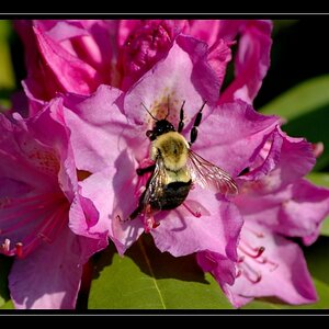
2)

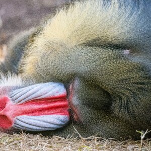
3)

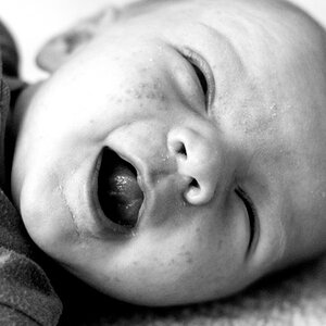
4)

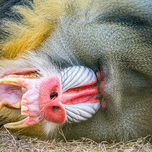
And the captor:
5)

I thought the blur on the captor keep his identity hidden and kept a mystery about him.
Whats your thoughts?
On edit was resize and border.
Shot in RAW.
So todays word:
Captive
cap‧tive  /ˈkæptɪv/ Pronunciation[kap-tiv]
–noun
1. a prisoner.
2. a person who is enslaved or dominated; slave: He is the captive of his own fears.
–adjective
3. made or held prisoner, esp. in war: captive troops.
4. kept in confinement or restraint: captive animals.
5. enslaved by love, beauty, etc.; captivated: her captive beau.
Captive
No longer free
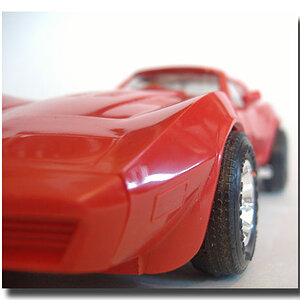
1)
No longer free
2)
3)
4)
And the captor:
5)
I thought the blur on the captor keep his identity hidden and kept a mystery about him.
Whats your thoughts?
On edit was resize and border.
Shot in RAW.
")

![[No title]](/data/xfmg/thumbnail/36/36677-3b91df53323d0850489794f28b3b9800.jpg?1619737677)