CC my first maternity shoot please.

juicegoose

TPF Noob!
Joined
Sep 4, 2013
Messages
102
Reaction score
4
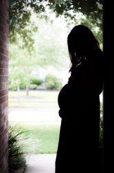
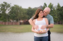
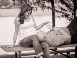
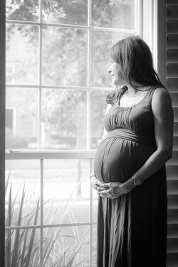
Well it finally happened. A good friend asked that I take their maternity pictures for them. Being a male I tend to struggle with the "oh I'm not a woman so I can't think of those lovey dovey poses" type of mindset. I stepped out of my comfort zone though and these were what I thought were the best.
Honestly, overall I just wasn't happy with the whole shoot.
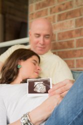
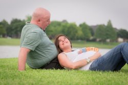
1. I had told them before hand to not wear any sort of patterning on their clothes. I knew he carried a lot of weight in his waist and wanted to minimize it as much as possible. Of course he showed up in the striped polo you see in the pictures and the outcome was as expected. Any advice to get around this?
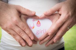
2. In my nervousness I failed to change my metering mode to spot and set my exposure off of her white shirt. The matrix metering did a good job on the original shot but it overexposed her shirt. That was a learning experience for sure.
3. The day of the shoot had been overcast and just not the best light. I had put off the shoot as late as I felt I could but it still gave for a blah background in my eyes. Second lesson learned.
Hopefully some of you seasoned vets can shed some light on what you think.
Thanks for any advice.


Gulp!! tear em up guys.
$July 20 2014_1.jpg
$July 20 2014_7.jpg
$July 20 2014_12.jpg
$July 20 2014_14.jpg
$July 20 2014_16.jpg
$July 20 2014_18.jpg
$July 20 2014_20.jpg
$July 20 2014_23.jpg
$July 20 2014_24.jpg
 
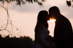
Looks like you need to figure out your camera settings and think about your aperture/depth of field. In the first the window almost looks fogged up but I think it was glare? that to me just didn't work. In the second one she's just too dark and it almost looks like a B&W photo except for the brick - if you were going for a silhouette it probably would have been better with her head up to get a nice profile of her face (and maybe no gap between her and the wall) - perhaps just going B&W might have been better. The one showing the photo has too much of the photo out of focus and more than enough space above their heads but rather tight across the bottom. I don't think the positioning for him was always the best at that angle, I don't think the pattern of the shirt is actually that distracting but looks like it was tucked in pretty tight. The one of him standing behind her worked nicely, but the picnic table photo is too cut off (she really looks cropped off). I like the idea of the last one except for the orange bit of flare on his chin, and I wonder if that one too would have been better as a B&W silhouette or needs some adjustment since you were shooting into the sun (and maybe the exposure was off). To me it looks like you might need to work on framing and exposure more before you get too much further into portraits since you had some good ideas and seemed to get some nice expressions from your subject - maybe work on the technical skills more in a variety of lighting and in different situations.
 
Looks like you need to figure out your camera settings and think about your aperture/depth of field. In the first the window almost looks fogged up but I think it was glare? that to me just didn't work. In the second one she's just too dark and it almost looks like a B&W photo except for the brick - if you were going for a silhouette it probably would have been better with her head up to get a nice profile of her face (and maybe no gap between her and the wall) - perhaps just going B&W might have been better. The one showing the photo has too much of the photo out of focus and more than enough space above their heads but rather tight across the bottom. I don't think the positioning for him was always the best at that angle, I don't think the pattern of the shirt is actually that distracting but looks like it was tucked in pretty tight. The one of him standing behind her worked nicely, but the picnic table photo is too cut off (she really looks cropped off). I like the idea of the last one except for the orange bit of flare on his chin, and I wonder if that one too would have been better as a B&W silhouette or needs some adjustment since you were shooting into the sun (and maybe the exposure was off). To me it looks like you might need to work on framing and exposure more before you get too much further into portraits since you had some good ideas and seemed to get some nice expressions from your subject - maybe work on the technical skills more in a variety of lighting and in different situations.

Thanks for the feedback.
I agree with your comments on the window. It had rained earlier so the window had fogged. I'm sure there was some glare as well though.
I'll remember your comments on her head positioning and such for if I do that shot again in the future. Thanks.

I did throw some post processing at the images to soften them as well as a little desaturation. I had masked off that picture but it could have been out of focus too. To me that whole image with her white shirt on the white picture just blended together. I also had cropped that image in post. I'll see if I can re crop it a little wider with less dead space.

The picnic table shot was cropped in post as well. There was a lot of concrete and dirt/puddles that I didn't feel added to the shot. I guess I went to far.

I have a couple other sunset silhouette shots with the sun actually behind them more and the flare gone. I just pulled a couple from my website and enjoyed how the posing almost had a heart shape working.

work on framing absolutely!!
I'm not sure what your meaning by work on exposure. While taking the picture I did ensure that I had the exposure correct(although ya I goofed on the spot metering setting). Do they all seem like the exposure was off?
 
I've reposted this under the proper forum section. Please delete.

Thanks
 

Most reactions

Back
Top