Christie
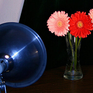
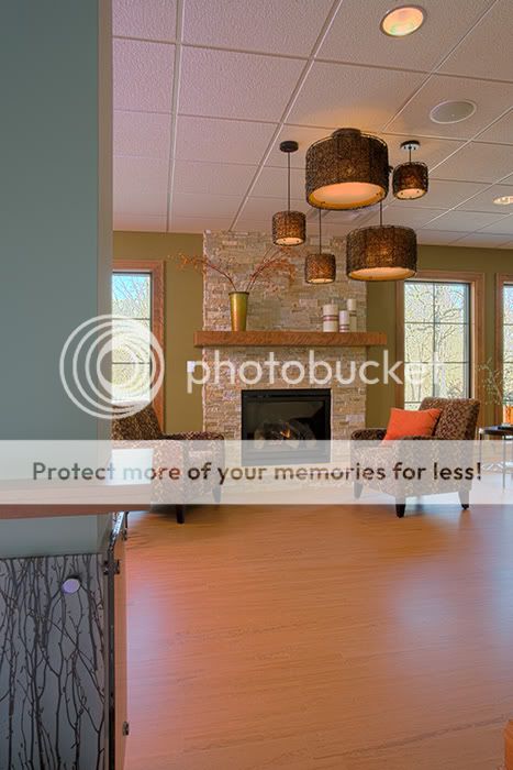
The first image is well done. The lines are good and so is the lighting/color. Of course not knowing the actual color, I am saying the color looks good.
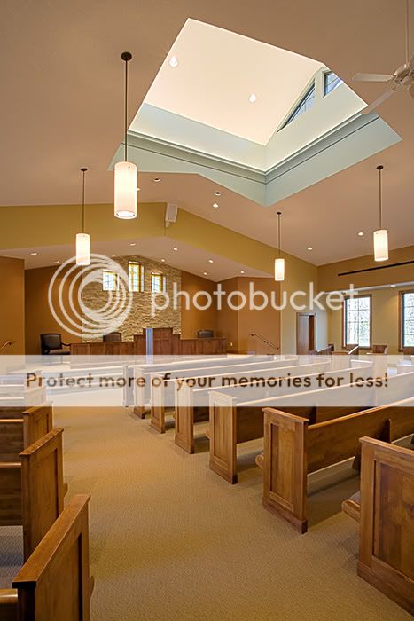
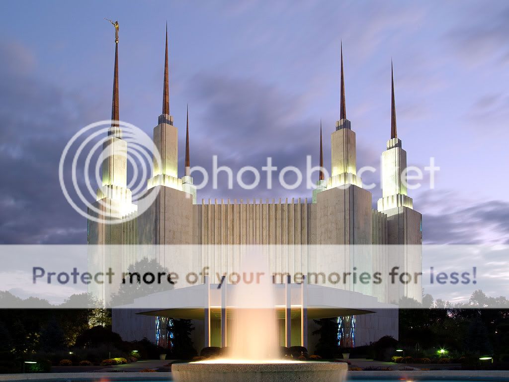
The second shot has a pinkish glow. Were you trying for that?
Christie
The first image is well done. The lines are good and so is the lighting/color. Of course not knowing the actual color, I am saying the color looks good.
The second shot has a pinkish glow. Were you trying for that?
No... I wasn't trying for the pink ceiling. As you can see, I had daylight, incandescent, and whatever was in those can lights, so just tried to average everything out. I considered bringing down the saturation in the ceiling a bit... make it closer to neutral in hopes of fooling the eye into believing the overall colors are believable. I'll spend a bit more time on it.
Nicely done, I agree about the second image.. i can also see alot of cyan there tho (you can see its a little strong out the windows and is effecting the highlights on the floor) probably due to the wall colour?
Good job tho :thumbup:
Nicely done, I agree about the second image.. i can also see alot of cyan there tho (you can see its a little strong out the windows and is effecting the highlights on the floor) probably due to the wall colour?
Color issues aside, I really like these shots (well, really like may be a bit strong, they aren't exciting but they are done very well).
In the 2nd, for example, I like how you included just a bit of the green/teal wall. It shows that the further area is separated but allows you to show both the details of the wall and the room in the background. A bit of wide angle distortion going on, but nothing to worry about.
They're commercial because they're used in commerce... to sell or promote a product or service.
So commercial photography includes: products, industrial, architecture, fashion, and so on. There are some specialty subcategories like furniture, automotive and food photography.

![[No title]](/data/xfmg/thumbnail/31/31980-e5048a424621c7b3cd0d306d63c09d67.jpg?1619735137)
![[No title]](/data/xfmg/thumbnail/37/37612-989c0c475619355f32a5941a187cfa74.jpg?1619738150)

![[No title]](/data/xfmg/thumbnail/32/32180-aee1597d1cfb87ae220637f19420b65b.jpg?1619735235)