Church

Tuffythepug

No longer a newbie, moving up!
Joined
Jul 17, 2012
Messages
851
Reaction score
278
Location
northern California
Can others edit my Photos
Photos OK to edit
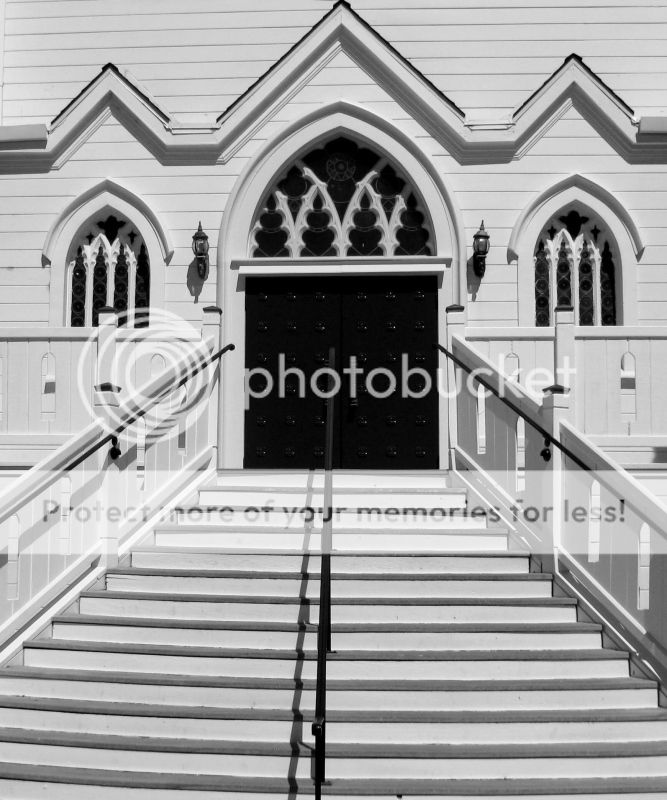
Here's a picture of a church in the Calif Delta town of Rio Vista

churchbw.jpg


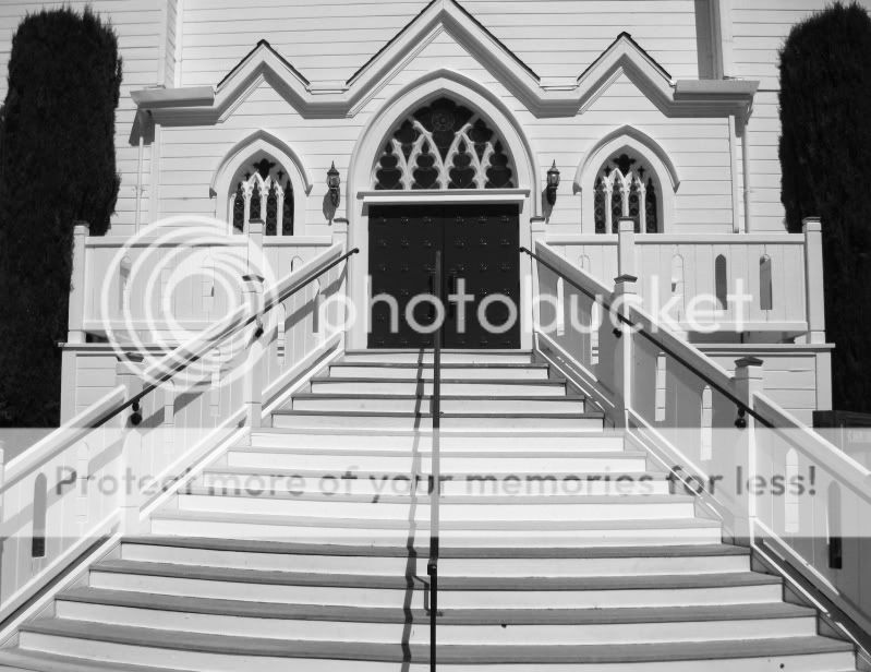
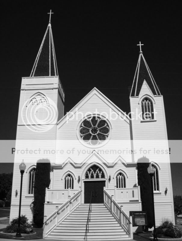
here's another shot of that church

churchbw-1.jpg
 
A bit late, but kudos for the second pic. The first one is strong to, but somehow doesn't tic me, maybe is the angle, it appears a bit flat, without depth I think.
 
Just a few things from me:
I'd like to see the sky a little lighter.
It seems you lost a lot of detail in the hedges
It could use some perspective correction on the converging lines of the church and it may be tilting a little to the left.
I not busting on your photo though. This is actually the type of B&W I enjoy viewing

EDIT: I'd really like the first shot if you could just bring back a little detail in the green hedges
 
So California really IS sinking into the ocean! I thought that was an urban myth.
 
In general they both are nice pics, I tend to like contrast in b&w, the only two points I would add, in shot number 1 it is a bit cropped to much, the center gable is cut off if it was there I think it would add some balance, and shot number 2 is slightly tilted to the left, it's not huge and maybe that it a bit nit picky, other then the other issues already mentioned by others that's all I have.
 
Thanks for the replies folks. This is the best thing about the forum in my opinion. It has forced me to step up my game and pay much more attention to detail. I'm realizing that, when I take a critical look at some of my shots, there are obvious flaws. I do value each and every comment; good or bad.

Rick58, I'll spend some time trying to make a few tweaks with respect to your suggestions. This series of pictures was shot digitally. I think I will re-shoot with my Bronica 645 and pay more attention to some of the things that have been brought to my attention here.

Funny thing is that when I decided to print one of these shots I went with an even tighter crop with this picture as a result. It reduces everything to lines and shapes. I rather like this perspective. Of course it completely eliminates the sky and the hedges though

ChurchStepscropped.jpg
 
Tuffythepug said:
Thanks for the replies folks. This is the best thing about the forum in my opinion. It has forced me to step up my game and pay much more attention to detail. I'm realizing that, when I take a critical look at some of my shots, there are obvious flaws. I do value each and every comment; good or bad.

Rick58, I'll spend some time trying to make a few tweaks with respect to your suggestions. This series of pictures was shot digitally. I think I will re-shoot with my Bronica 645 and pay more attention to some of the things that have been brought to my attention here.

Funny thing is that when I decided to print one of these shots I went with an even tighter crop with this picture as a result. It reduces everything to lines and shapes. I rather like this perspective. Of course it completely eliminates the sky and the hedges though

I really like this version I like that you have the middle gable back in it, it was similar to cutting off someone's head to me, now it helps to draw your eye up the stairs, the hedges didn't add anything that was great move. Much better!
 
I think I will re-shoot with my Bronica 645 and pay more attention to some of the things that have been brought to my attention here.

Funny thing is that when I decided to print one of these shots I went with an even tighter crop with this picture as a result. It reduces everything to lines and shapes. I rather like this perspective. Of course it completely eliminates the sky and the hedges though

ChurchStepscropped.jpg
And I think that's better, this framing makes more sens. At least to me, no distractions of this dark hedges.
I will be waiting for that shots done with Bronica with top curiosity.
 
Tuffythepug said:
Thanks for the replies folks. This is the best thing about the forum in my opinion. It has forced me to step up my game and pay much more attention to detail. I'm realizing that, when I take a critical look at some of my shots, there are obvious flaws. I do value each and every comment; good or bad.

Rick58, I'll spend some time trying to make a few tweaks with respect to your suggestions. This series of pictures was shot digitally. I think I will re-shoot with my Bronica 645 and pay more attention to some of the things that have been brought to my attention here.

Funny thing is that when I decided to print one of these shots I went with an even tighter crop with this picture as a result. It reduces everything to lines and shapes. I rather like this perspective. Of course it completely eliminates the sky and the hedges though

I really like this version I like that you have the middle gable back in it, it was similar to cutting off someone's head to me, now it helps to draw your eye up the stairs, the hedges didn't add anything that was great move. Much better!


seakritter, the un-intended crop of the top of the gable is one of those details I should have noticed. I was preoccupied with getting the perspective of the leading lines going right to the dark doors and neglected that detail.
I think this crop tends to draw you right into the picture with fewer distractions.

Still have the problem of the siding being crooked. I have to fix that in the next shots

Timor, yes I am looking forward to seeing what I can get with the Bronica. Whatever it is you will see it here !
 
Timor, yes I am looking forward to seeing what I can get with the Bronica. Whatever it is you will see it here !
This is not easy shot; sun blasting light on white church, but I think with film managing the zones would be easier.
 
Nothing crys for B&W tones like a white clapboard church...nice job!
 

Most reactions

New Topics

Back
Top