Claire – senior outdoors

Christie Photo

No longer a newbie, moving up!
Joined
Jan 7, 2005
Messages
7,199
Reaction score
148
Location
Kankakee, IL
Website
www.christiephoto.com
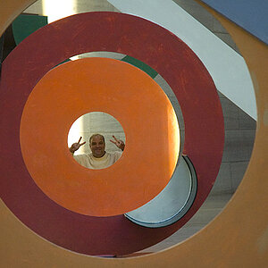
From a recent senior session. As always, I'd be grateful for any critique.

Thanks!

–Pete


1.
IMG_3677.jpg


2.
IMG_3656_1.jpg


3.
IMG_3696.jpg


4.
Claire.jpg
 
I like the lighting if it's not all natural, you pulled off that look incredibly :)
 
Great work Pete, as always.

The posing is great. They look very natural & comfortable, but they don't have the little annoyances that we tent to see from less experienced photographers.

I keep thinking that the first photo is a bit dark, especially her face & eyes. But when I adjust my viewing angle and scroll the image down the screen, it looks much better. I'm sure the print will look much better, but there is still a little bit of attention being stolen from the face by the bright yellow scarf. I love hold the scarf is a bold element in the photo, but the face & eyes really have to shine to compete with that. But like I said, it probably looks better when not on my crappy monitor here.
 
These all look a bit darker than I would like them to be. I pulled 3677, the first image into PS, and the green channel seems under, and the blue channel seems well under maximum. They look just a tad too low in contrast and exposure value to me. It's obvious though that you know your way around a camera! Not that you have anything to do with it, but these new jeans girls are wearing this season, with the bright, white crease lines are simply awful in terms of drawing attention...it's an awful look, but the fashion design companies seem to be selling the daylights out of these awful new jeans...
 
One question. The bottom of the last photo, looks like an out of focus foreground, but it doesn't look like you're that close to the ground to have those little blades of grass. Are they really tall grass, are you that close to the ground or did you add that after?
 
I am very picky with ripped jeans.. The ripped shape isnt very good :). A little too big for my taste. But I like the photos ;)
 
I keep thinking that the first photo is a bit dark, especially her face & eyes. ... there is still a little bit of attention being stolen from the face by the bright yellow scarf.

I agree with Derrel that they ALL look just a bit dark here. I'll do a bit of work on her eyes.

Yeah... that yellow scarf! I was hoping to get a bit of yellow in the background so it would all make sense. Oh well.

Thank you, Mike for the critique.

-Pete
 
These all look a bit darker than I would like them to be. I pulled 3677, the first image into PS, and the green channel seems under, and the blue channel seems well under maximum. They look just a tad too low in contrast and exposure value to me.

I have to admit, this is all beyond my understanding. I've always been aware of my deficiencies in processing, but haven't done anything about it. I do work on a calibrated monitor. And I watch the histogram as to not clip the highlights. But anything more than that is lost on me. I suppose it's time for a class or two.

It's obvious though that you know your way around a camera!

Thanks for that!

Not that you have anything to do with it, but these new jeans girls are wearing this season, with the bright, white crease lines are simply awful in terms of drawing attention...it's an awful look...

Yes, it is.

Thanks, Derrel, for taking time to critique.

-Pete
 
One question. The bottom of the last photo, looks like an out of focus foreground, but it doesn't look like you're that close to the ground to have those little blades of grass. Are they really tall grass, are you that close to the ground or did you add that after?

It's a combination of tall grass and me being a bit higher up the river bank. I shot from a tripod around eye-level.

Thanks!

-Pete
 
These all look a bit darker than I would like them to be. I pulled 3677, the first image into PS, and the green channel seems under, and the blue channel seems well under maximum. They look just a tad too low in contrast and exposure value to me.

I have to admit, this is all beyond my understanding. I've always been aware of my deficiencies in processing, but haven't done anything about it. I do work on a calibrated monitor. And I watch the histogram as to not clip the highlights. But anything more than that is lost on me. I suppose it's time for a class or two.

Its not much further than the histogram - when you view the histogram have a look around the control and you should be able to show an RGB histogram (both in camera and in the computer) or even just show red, green or blue on its own.
I've done this a lot with flowers and wasps when yellow (red channel) will often overexpose a lot even when the overall histogram is well exposed the red channel will clip and need either reshooting or correction in editing.

Have a look here for a bit more info: Reading Histograms-- Part I
 
I think the first two poses/outfits are much more flattering.. The last two make her look a bit "bigger" than she is. Excellent work though.
 

Most reactions

New Topics

Back
Top