Colours of the season.

Ron Evers

Been spending a lot of time on here!
Joined
Jun 28, 2008
Messages
6,630
Reaction score
2,588
Location
In the country 60km north of Toronto, Canada
Can others edit my Photos
Photos OK to edit
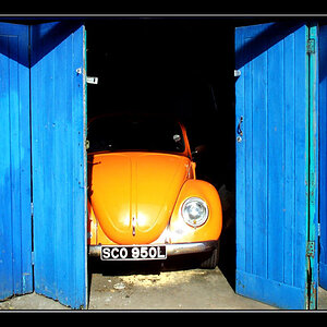
1. Front lit morning light.

P1040730sm.jpg


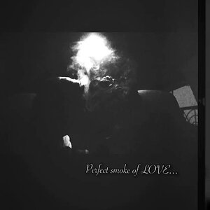
2. Back lit evening light.

P1040724sm.jpg
 
Such vivid colors. Was it like that the whole time or was editing involved because i am having problems getting the colors
 
Such vivid colors. Was it like that the whole time or was editing involved because i am having problems getting the colors

That's the way the light works, it is not due to processing. The reflected light in #1 does not produce the vivid colour of the light passing through the leave as in #2. However, I find front lighting better for seeing detail.
 
The first one looks like it's been over-sharpened.. did you do anything to it? It could just be the fact that there's so much fine detail in the picture with sharp lighting making it look like that.

Example of what I'm seeing.. (bottom half):

2vxkksk.jpg
 
There was minor sharpening in both photos. However, #1 was taken with a very sharp lens, a Helios 58/2 & #2 with an OK lens, a Soligor 35-70/3.5-4.5.
 
Ahhhhhh I love fall... Too bad we don't get those amazing colors in Georgia:thumbdown: Great shots though!
 
NICE!
I am in Florida but oh how I miss FALL Colors! The Mountains of Virginia and the coast line of NC! *tear*
 
NICE!
I am in Florida but oh how I miss FALL Colors! The Mountains of Virginia and the coast line of NC! *tear*

I feel your pain... No awesome leaves changing in Georgia for the fall either.... ahhhhh, is there anything good about the south?? hahahahaha
 
I'd have to say that the colors look very oversaturated. In the first image, the blues cutting through the trees look like they were darkened and saturated in post. Thee's a lot of blooming/purple fringing going on. The second photo the red leaves are over saturated to the point of losing detail.
 
I'd have to say that the colors look very oversaturated. In the first image, the blues cutting through the trees look like they were darkened and saturated in post. Thee's a lot of blooming/purple fringing going on. The second photo the red leaves are over saturated to the point of losing detail.

#1 +5 saturation in Lightroom
#2 +2 saturation in Lightroom

Not excessive I think.
 

Most reactions

New Topics

Back
Top