Inklingforsake
TPF Noob!
- Joined
- Feb 2, 2017
- Messages
- 39
- Reaction score
- 14
- Location
- NY, USA
- Can others edit my Photos
- Photos OK to edit
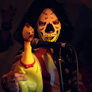
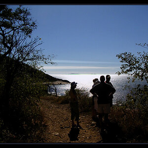
I am a beginner and have been using Nikon D3400 for about 3 months now and I just bought the Nikkor 50mm/1.8G prime lens.
The picture below did not pop according to me. So I did some editing (very new to editing and not even sure if I am doing the right thing).
Which one is better? Before or After or would you suggest something else? OR is it a bad shot? Please critique!
Settings: 1/325, f/1.8, ISO 200, no flash
Original

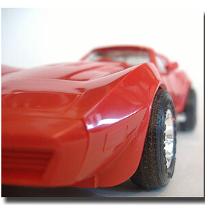
Edit 1

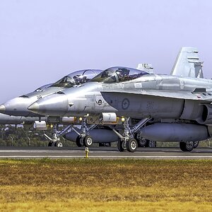
Edit 2

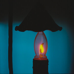
The picture below did not pop according to me. So I did some editing (very new to editing and not even sure if I am doing the right thing).
Which one is better? Before or After or would you suggest something else? OR is it a bad shot? Please critique!
Settings: 1/325, f/1.8, ISO 200, no flash
Original
Edit 1
Edit 2
![[No title]](/data/xfmg/thumbnail/39/39491-353a6df9b207e97dadcdce4f98248fcd.jpg?1619739051)