Composition and Framing Tests - CC Please

beaminge36

TPF Noob!
Joined
Sep 17, 2008
Messages
126
Reaction score
0
Location
Newark, NJ
Can others edit my Photos
Photos OK to edit
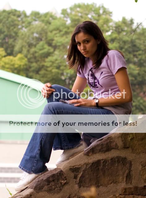
Hey, I took a few pictures today messing around with different concepts. I failed miserably at most of my attempts but these two I felt were a decent starting point. The first picture is an attempt at using framing to guide you to the subject. The second is an attempt at a less static composition with the angled wall and sideways subject. Both seem to be lacking something. The first maybe a lack of expression? The second just doesnt seem to move me too much. What are your thoughts and advice for the two? (They were shot on an overcast sky and she will be my subject until i feel confident enough to approach strangers)
Thanks in advance,

Nick

1. f/20, 1/30sec, ISO-400, 50mm
FramingTest.jpg


2. f/2.8, 1/1000sec, ISo-400, 50mm
CompositionTest.jpg
 
I think compositionally they are both very good. And a very cute model.

To nitpick...

#1 The rust on the edges of the first row of bars is a little little distracting to me. Maybe use the healing tool or clone out the rust.

#2 Good pose, nice composition, she looks a little uncomfortable, and the sky being blown out kinda pulls away from her. I might clone out the branch behind her head, I don't know. Sill a really nice shot!

Anyway my opinion only, and not much to that. Im still learning this too..
 
Very good idea on the first one. Original way to frame subject. Maybe the leaves and the spots on the railing are a little distracting, but a great concept.
 
DRATOM - Thanks for the input. Looking back she does look a little uncomfortable. Some of the other shots looked a bit better with that respect but the hair was static and some of the expressions didn't really speak to me. I originally cropped the top of the sky out but felt that it was too close to her head.

rbraden - Good call on the leaves, they're annoying me too. I think big when taking photos as im trying to learn all the basic concepts and technicalities but I miss out on the details. Hopefully as the basics come more naturally I will be able to focus better on the small stuff.

thanks again for the advice, everything is welcomed.

Nick
 
Bah. I looked at these earlier and couldn't totally put my finger on what was wrong. Didn't want to sit here and nipick them, but I'd like to offer help if I can.

On #1, I'm not sure what about it is bothering me, but it's something. Might even just be the shades. Might be that her hair is just kinda "there"... might even be that we just kinda chopped her head off. The "ribs of iron" are kinda neat conceptually, though I think it bothers me that they aren't perfectly centered in the shot (you're at a slight angle which throws off the symmetry a bit)... honestly, that may be the primary issue for me. Again, not sure.

#2 seems like a pretty good shot to me, but that background is bad. Seriously bad. If you took the same shot from the other side you would have at least gotten blue skies. Hazy, but blue. Try to keep the sun roughly to your back in shots whenever possible. A graduated ND filter would have helped here too, but I always feel like that is seriously cheating.

I personally watch the weather like a hawk when I have to shoot outside. I check cloud cover, humidity, air quality, etc. The worse the day is, the less likely I'll go out to get the shot. The sky and the air quality have SUCH an impact on your images. (Granted, if you WANT that kind of look, then fine...) Usually, however, you don't.
 
Is it my eyes or is the focus in the first slightly above her face (second and third rung are sharp, her face - reflection in the shades - is not). The idea is good. Copy-worthy, I should say (though I really don't know where I have ever seen a playground with climbing toys shaped like this here :scratch: ).

Her face is a bit dark in the second, which is emphasised by the bright sky in the background. The idea of placing her on an inclined wall is cool, though the effort she must apply to stay put shows in her face somewhat. The given light made her eyes go all dark without a catchlight. Catchlights make eyes look a lot more "vivid", "alert", "alive". So a huge sheet of white paper (bed cloth, mother's best table cloth ... cough-cough, hey, no, I didn't suggest THAT) as reflector might help next time. Or the use of fill-flash, though setting the flash well enough to JUST fill in the missing light but not flatten the face of the model is not easy. Requires a good deal of trial and error. But if she's willing to pose and pose again... why not? It's good fun, isn't it? And she is a very pretty model!!!

What does she look like when she laughs?
 
manaheim - thanks for the nitpicking. As an engineer, I feel all the small details are what sets apart the good from the great so i appreciate comments on the details.

laFoto - I live 5 minutes from the park and my model is my gf so I have unlimited access to repeating and retrying the shots in different light and time of day. I dragged her out because I wanted to try shooting on an overcast sky rather than direct afternoon sunlight. She had a headache all day so she wasn't in the mood for just sitting while i mess with the settings and try various attempts. below is a link to my first post. The third picture is her smiling. Alot of the pictures I took when she smiles came out bad in one way or another.


http://www.thephotoforum.com/forum/showthread.php?t=138491

Thanks again guys.
 

Most reactions

New Topics

Back
Top