fightheheathens
TPF Noob!
- Joined
- Aug 1, 2005
- Messages
- 1,011
- Reaction score
- 3
- Location
- Berkeley
- Can others edit my Photos
- Photos NOT OK to edit
Hey, this is my first post, i got into photography about a year ago and i did a study abroad in Germany and got a lot of good photos.
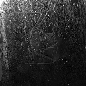
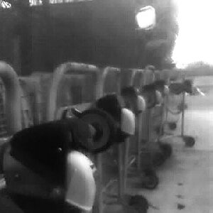
This photo is from the Concentration Camp Dachau out side of Muenchen Germany. 200,000 people were killed at this camp and near the end their bodies were disposed of in these ovens. The image was taken with a Canon A80 4.0 megapixil camera and shutter speed of 1/60 and f/3.5 ISO 400. The shot is underexposed on purpose and I took it with the ISO 400 setting on purpose so that it would look grainy...
I also darkened this image up in photoshop, the origional is slightly lighter with no completely black areas, but i think the darkness adds to the effect of the picture.
This is one of what i think is my best pictures and im just looking for ways i could have improved this image and what not.

-edit, i noticed that the image i had put up did not match up with the one that i printed out as far as darkness etc, i took the origional and messed with it in photo shop until its appearence on screen matched the one that i printed out, so once again any suggestings on composition, or what you think about darkening the photo to match more the mood of the place would be helpful, remember 200,000 people died in these ovens and that feeling of hopelessness and death is what im trying to convey.
-Jon
This photo is from the Concentration Camp Dachau out side of Muenchen Germany. 200,000 people were killed at this camp and near the end their bodies were disposed of in these ovens. The image was taken with a Canon A80 4.0 megapixil camera and shutter speed of 1/60 and f/3.5 ISO 400. The shot is underexposed on purpose and I took it with the ISO 400 setting on purpose so that it would look grainy...
I also darkened this image up in photoshop, the origional is slightly lighter with no completely black areas, but i think the darkness adds to the effect of the picture.
This is one of what i think is my best pictures and im just looking for ways i could have improved this image and what not.
-edit, i noticed that the image i had put up did not match up with the one that i printed out as far as darkness etc, i took the origional and messed with it in photo shop until its appearence on screen matched the one that i printed out, so once again any suggestings on composition, or what you think about darkening the photo to match more the mood of the place would be helpful, remember 200,000 people died in these ovens and that feeling of hopelessness and death is what im trying to convey.
-Jon

 ). I like the darkness in the photo and I think the shadow of the people adds to it. It gives that feel of people still lingering there like terri said. It makes it a very dramatic photo.
")


![[No title]](/data/xfmg/thumbnail/37/37604-7ad625e983f92f880eb65a264eeef5e4.jpg?1619738148)
![[No title]](/data/xfmg/thumbnail/37/37602-1ef8dbb1c2d0e4ff347ee65d328c3603.jpg?1619738147)