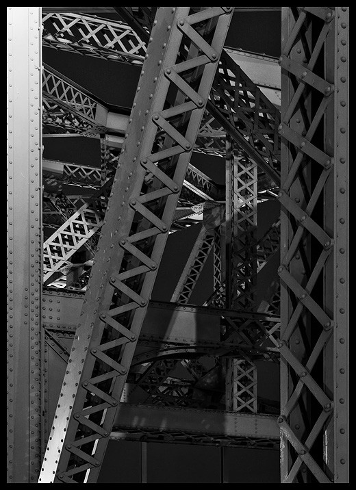
Here is another from that night. The sky is darker here. It was from a different part of the bridge, shot looking away from the city, rather than towards, which explains why the sky is darker here. I don't think this one is as successful as the first post. I like it, but it has less impact, IMO. This only went through Denoise, and a sharpen.
I'm not a huge fan of selective color but the last pic posted looks like it would be fun to mess arount with in that respect. Just some very muted blues and greens fading in and out, here and there.

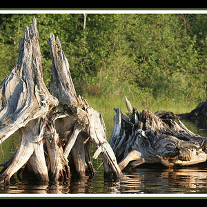
![[No title]](/data/xfmg/thumbnail/34/34073-71bff52a53b8313ff2bcccab6b05f9b8.jpg?1619736266)
![[No title]](/data/xfmg/thumbnail/36/36100-56ca0f8143ffca369fbf5f3dfe9cabd4.jpg?1619737343)
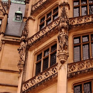
![[No title]](/data/xfmg/thumbnail/41/41760-e5b9dc90c1289f677ce3ca9dc1fa6dde.jpg?1619739884)
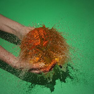
![[No title]](/data/xfmg/thumbnail/42/42397-30faa170de7ed9be38adf00b9b26a220.jpg?1619740167)

![[No title]](/data/xfmg/thumbnail/34/34072-be456691237ae73cb2936416e2e9e8c0.jpg?1619736266)