Thanks Peter, I appreciate your feedback. I was shooting for the lines and the shadows, any lower I would have lost the shadows any higher I would need to grow a couple more inches. What works for me may not work for you or anyone else for that matter and that’s cool. Popularity has never been my strength I’m more partial to individuality. Thanks again!
I like it.
The whole photo is just lines.
All lines.
Only do I think there might be a bit too many for the BENCH to be the primary subject here, for my eyes get drawn to the wall in the background (the white one, not the one with the window), where the top line so perfectly goes with the border. That is what I look at most, for some funny and inexplicable reason... :scratch:
I like this, I see where you were going for the lines. I can't help wonder what it would look like if taken just a few feet left, so you were lined up with the end of the bench.
The first is really nice. I'd put a bit more contrast, but it's matter of choice. And a frame. (yeah, addicted to frames)
The second one, is like you said, dead.
i like em randog....the angle on the first would have been more dramatic at an even wider angle focal length.
the second I like the way you lined it all up...the stairs or ramp at the back looks like ti would make for some great geometric shots if you get in close to it and experiment.
Thanks Jon! You do know you are like my mentor right? I do have another shot here that may be closer to what you have recommended. I also increased the contrast a little more in this on per Willpops suggestion.


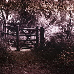
") not feeling it imo, maybe the wrong hieght?, or angle taken?
not feeling it imo, maybe the wrong hieght?, or angle taken?


![[No title]](/data/xfmg/thumbnail/39/39478-0db485f4efaffd784bfa5cc75ff7502f.jpg?1619739046)
![[No title]](/data/xfmg/thumbnail/31/31748-63241c520f250328a5ec32959b8f53d0.jpg?1619734989)
![[No title]](/data/xfmg/thumbnail/33/33360-ff0b69685c94740bde3f53b6d7aa9af1.jpg?1619735924)