Couple O' posed shots.

Juice

TPF Noob!
Joined
Jul 1, 2010
Messages
419
Reaction score
51
Location
Varies
Website
www.chaosjourney.com
Can others edit my Photos
Photos OK to edit
The severe majority of the photos I take are candids and/or lifestyle type shots. I usually prefer to capture people in their element, which gives a lot of personality to a photo. Recently I've thought about dabbling in posed shots. I've always steered clear of them for the exact reason I like candid shots, you get the subject's true personality. A lot of people tend to freeze up, or act unnatural in front of a camera, so I tend to avoid posing them. However, in the interest in expanding my photographic usefulness, I'd like to start doing some posed shoots to get a better understanding of how to do them. I've been approached by people recently about doing various shoots for them, so I'd like to be able to help out as well as give them something worth keeping.

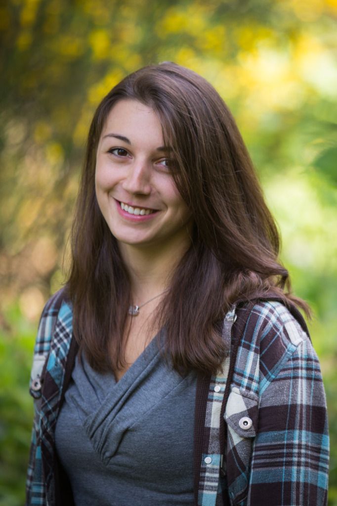
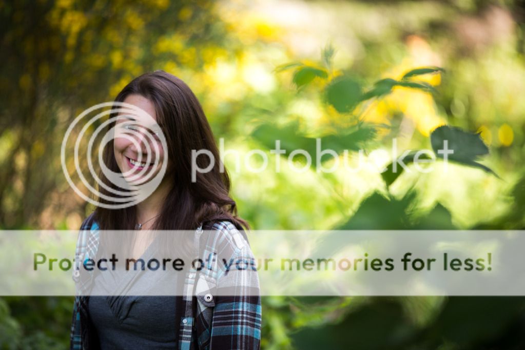
Novella aside, here are a couple of posed shots that I took. I realized when I started doing it that it's a lot harder than it seems when the pressure is on you to compose the scene and pose someone who is only moving specifically to your direction. I think it will be a fun challenge, but a challenge nonetheless. I'm interested in what you guys look for when posing a shot, and maybe any off the top of your head advice you'd have for posing. General photo CC is also always appreciated! ;)

IMG_1489.jpg


IMG_1495-2.jpg
 
Decent shots but a little too much dead space. The bw treatment was nicer but I think the crop is too tight. Crop on #2 is better but chop it to a portrait view.
 
no complain here. I typically dont like a square crop though. What lens?
 
Decent shots but a little too much dead space. The bw treatment was nicer but I think the crop is too tight. Crop on #2 is better but chop it to a portrait view.

Too much dead space on both, or just one of them? And what do you mean by dead space exactly? I'm pretty retarded when it comes to photo-lingo haha.

I tend to agree about chopping #2, but I really liked the blurry foreground leaves on the right. I know it distracts you from the subject, but I couldn't bring myself to cut them off. You're definitely right though. ;)

no complain here. I typically dont like a square crop though. What lens?

I chose the square crop because I shot it in landscape, and to keep the 2x3 ratio of the shot in a portrait orientation, she wouldn't have fit completely in the frame. Is there something you would do different with this crop?

Lens is Canon 70-200mm f/2.8L II

Thanks!
 
Look for the light to fall pleasingly on the subject, as an example in these two shots the light falls so that her eyes are shadowed and lost in the deep sockets. Get some light in there, give the girl some life.... Although I'm guessing her hair is part of her personality, get a few shots without it covering the eye.

Watch the negative dead space, if you are going to include dead space like this have it so the subject is moving or looking into it, not behind them.
 
Juice; If these were mine, I would crop both of them to a regular-ratio portrait frame. Bring down the top, crop both sides, and especially #2 right side. All that extra space is not doing you any favors.
 
Alright, I cropped them down. Is it because the background is so blurry that these should be cropped? If there was more detail in the background, would it be preferable to have a little more around the frame? I don't know what the hell I'm doing haha.

IMG_1489-3.jpg


IMG_1495-3.jpg
 
You want to crop them down because the beautiful girl is what you want our eyes to be drawn to not have us looking off into all that wasted space wondering what's out there.
 
Ya, those ginormous leaves in #2 made me worry she was being attacked by some berserk Day of the Triffids plant. But seriously, the closer crops are more appealing, imo.
 
I don't think it's the dead space, but more busy background that's a bit distracting. To me, a good use of dead space can bring attention to the subject and a sense of peace/calm.

I think her face is a bit under exposed which caused the viewers to wander off into other brighter areas in the frame, which happened to be the busy background.

Very pretty subject. :)
 

Most reactions

New Topics

Back
Top