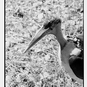
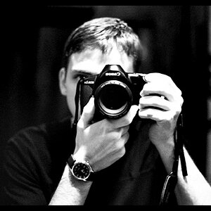
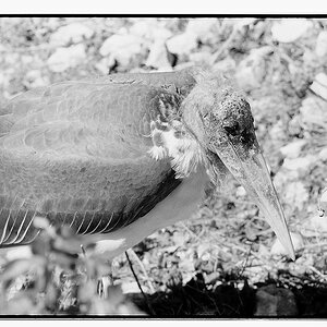
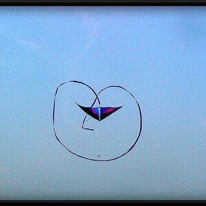
Criticism on my small portfolio.

I see 7 photographs, each with a rather distracting watermark on them.

You'll get a better critique if you post one photograph per thread and tell us something about how you made it and what you were trying to do. Also; larger and without the watermark.
 
Designer said:
I see 7 photographs, each with a rather distracting watermark on them.

You'll get a better critique if you post one photograph per thread and tell us something about how you made it and what you were trying to do. Also; larger and without the watermark.

I don't think he is allowed to post those images...part of the iStock agreement...they must appear with the watermark...anyway, I looked at them, and honestly, these are pretty mundane images.
 
Poorly lit clownfish. Every photo I've ever seen of one looks vibrant like they look in real life.
 
One general coaching item I would offer is that in each photo the main focal point does not stand out. Pick the main focal item - crop in on it a bit and light it up.
 
I think the newer stock outfits are looking for clarity and focus and legality but usually don't look at anything on the artistic side since a buyer may want anything.
 
I think your pink flower picture and your Boardwalk picture are your strongest, both have good composition and balance. The vignetting on the pink flower picture draws focus to your subject and the contrasting light and dark railings on the boardwalk picture invoke a sense of drama.
 

Most reactions

New Topics

Back
Top