Aquarium Dreams
TPF Noob!
- Joined
- Jan 14, 2007
- Messages
- 731
- Reaction score
- 0
- Can others edit my Photos
- Photos OK to edit
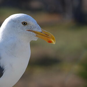
The colored reflections in his eyes, matched to the soft colors behind him, are really nice. And a little glow to the highlights you say? It looks lovely, very vibrant. I prefer the original, or maybe the second one. The third version is too washed out and lacks the punch of the original.



![[No title]](/data/xfmg/thumbnail/34/34058-276eb00b31d5bfacf4028e7f729dc601.jpg?1619736257)
