Critique needed of new Garden of the Gods photos

ashfordphoto

TPF Noob!
Joined
Feb 8, 2007
Messages
383
Reaction score
0
Location
Colorado Springs, CO
Can others edit my Photos
Photos OK to edit
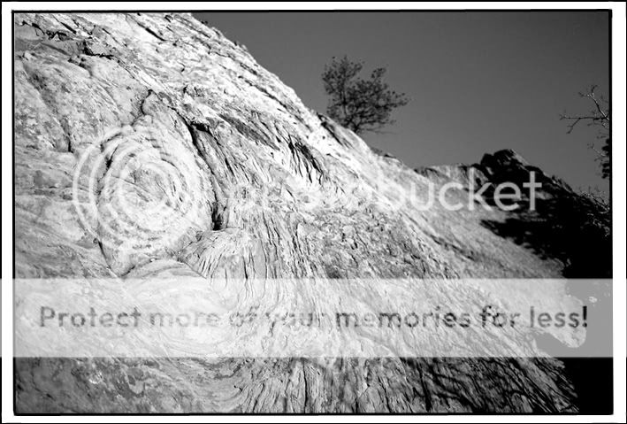
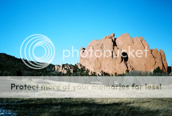
I went out again to Garden of the Gods today and got these shots. I'd really appreciate any feedback, good or bad. Help me learn....(ignore the sloppy framing) Thank you, friends!


1
swirlyrocklittle.jpg


2
meanrockfacelittle.jpg


3
color.jpg


4
color2.jpg
 
Were these shot on film? It Looks like that C41 B&W film with no color filters.
 
They were shot on cheap color film (6 rolls of 24 for $8) with a canon AE-1 and a polarizer. Walgreens was kind enough to put the film on CD in an hour :)roll: ) and I did some manipulation in photoshop.

It's my 2nd attempt at taking shots. I'm learning the camera and learning how light/f-stops etc. work. Almost all pictures I take right now need manipulation of some sort to make 'em work. Someday though I'll know enough to not have to do that.
 
okay. i'm begging. good, bad, ugly - just say something. you don't have to worry about being nice or saying the right thing. I'm just seriously needing some input!

give it to me! :spank:
 
My main critique is to keep experimenting. Some things to consider are:

- You have a wonderful "garden" of COLORFUL rock....a place whose major distinction from a...dare I say....garden variety place of scenery is arguably the beautiful red rock. So why wouldn't you accentuate that contrast?

- It looks like you may have used too high of a film speed on some of the shots....some grain that really shows up in the sky (esp. in the 4th shot). If this were digital that much "noise" would be unacceptable. If you're committed to film, don't use the cheap stuff.

- If you are just beginning I recommend going digital. The convenience and ability to discard bad photos without expense is invaluable.

- Your own comments should give you a clue....you stated that we should ignore the sloppy framing. Anything that is designed to compliment your image should at least be neutral if not an enhancement. It's hard to ignore something that is a distraction....no matter what part of the entire package it comprises.

- Lastly, don't post so many photos. There are still a few of us clinging to 56k dial up connections. You have almost 1.5 MB's of imagery here, and in addition it's difficult to comment in more detail with so many shots.

Good luck!
 
Very difficult to find anything to critique, this resolution isnt the best for 3, it makes it look blurred with that amount of detail in that number of pixels.

Possibly there could have been a darker or more detail in the sky of the last shot, it makes it less interesting that there is only the slightest gradient.

Bascially all very nice pictures.

tim
 
is the noise/pixelation because I played with it too much on photoshop or because of walgreen's upload?

Thanks for the comments - helps me a ton. I want to go digital, but my wife and I are buying a house right now so there's no cash for any upgrade. :thumbdown: But, thanks tpe and ccd for the good comments - i'm taking them in :thumbup:
 
ccd i put some color ones in there for ya. Hopefully saved them smaller too so it won't take up as much space.
 
What method did you tweak with to change the first two to B&W?
 
Changed it to greyscale, then played with levels, curves and a tiny bit of contrast. Mostly just played with curves and levels. I don't really know what I'm doing so I just move it around until I'm somewhat satisfied with the look.
 
Changing to greyscale/desaturating is not the most effective way, as far as I've learned/read on this site. Use the Channel Mixer, set the colour values to Red 60%, Green 10% and blue 30%. You can try fooling around with those values later, but I've always found they work for me like that. Then, click the Monochrome box.
 
awesome - thanks Tolyk. That'll help a ton. As soon as my wife gets off the computer that has PS I'll go play around and see what I can do.
 

Most reactions

Back
Top