Critique on flyer

A good rule of thumb for when you are laying out posters or flyers or anything for that matter is stick to 2 fonts, 3 at the very most. The more fonts that you have the less professional looking the ad becomes.
 
Less is more - the biggest mistake non-designers make when putting together something like this is to try to cram the space with too much info. And yes, as few different fonts as possible.
 
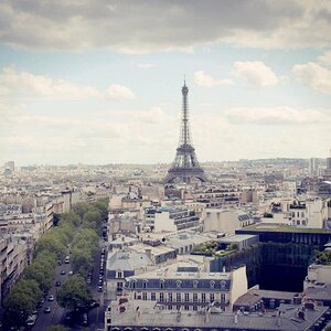
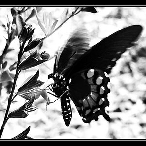
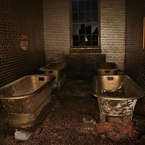
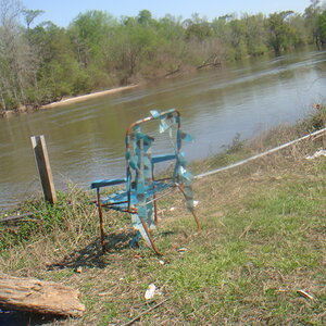
I think the last one is the best one so far. I think you really need to get rid of the blur borders though they just take away from the pictures.
 
I agree, less is definitely more in this case.
As what was said before, you have to "catch" your audience immediately.
If you don't accomplish that, they will just put your flyer down and you just wasted money printing flyers that are not going to make you any money.

1 - Choose a clean easy to read font for the majority of the text
2 - Choose a font for your company name that will portray the work you do
example :Strong and bold = powerful images
Script fonts = elegant images
Just keep in mind who you are trying to sell to.
3 - get rid of the faded edges they take away from the images and make them look cheap.
4 - PLEASE use a grid there is no order and the text and images look like they are just floating around with no organization.

personally, I would have these images bleed off the sides of the flyer, and not have any black space on the outside of the images, but thats just my opinion.
 
I took a couple minutes to just give you a little idea, play with it and see what you can come up with.

photoflyer.jpg


It will get the point accross.
Hope this helps.
 
Very very nice. I like the way you set that up. I didn't even think of something along those lines, opened up all new ideas. Thank you very much.
 
no problem. just keep in mind what is going to sell your services... and make that the most prominent part of the design.
 

Most reactions

New Topics

Back
Top