cfphoto
TPF Noob!
- Joined
- May 11, 2010
- Messages
- 58
- Reaction score
- 0
- Location
- Richmond, VA
- Website
- www.chrisfesslerphoto.com
- Can others edit my Photos
- Photos NOT OK to edit
Hey there,
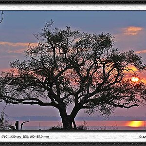
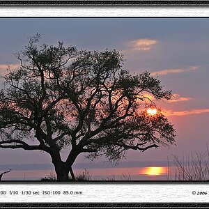
the website for my new buisness is about 85% complete. Any critiques/suggestions would be appreciated. Thanks!
www.chrisfesslerphoto.com
the website for my new buisness is about 85% complete. Any critiques/suggestions would be appreciated. Thanks!
www.chrisfesslerphoto.com


![[No title]](/data/xfmg/thumbnail/30/30864-50861ef77d7fa163bd5f5b5b8d661f5a.jpg?1619734483)

![[No title]](/data/xfmg/thumbnail/30/30865-3dc03385b0036f80524b0636d0d56f07.jpg?1619734484)