Critique please[Beach]

Leigh Wanstead

TPF Noob!
Joined
Nov 2, 2006
Messages
107
Reaction score
0
Website
www.smootharm.com
Can others edit my Photos
Photos OK to edit
Good morning,

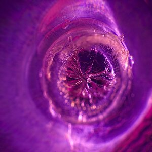
I need help from you to improve my art. So please tell me what do you think about this picture.

IMGA3023.JPG


TIA

Regards
Leigh
 
sure is a lot of red... is this supposed to be a bloody beach? what is your "art" that you want help with? what is the idea of using a red filter?
 
There has always been somthing about a monotone photograph that apeals to me and I like how the softness makes the image seem more abstract.

However, I think I would like the photograph more if it was in a different color like a more red than orange or a cool cyan. Also, the boat and the bird are distracting to me, like they got in the way while you were trying to capture the sunset.
 
I thought that red/orange add a mood to get a warm feeling. And seagull, boat to add some peacefull feeling.

Regards
Leigh
 
Wolff said:
the boat and the bird are distracting to me, like they got in the way while you were trying to capture the sunset.

I agree on the boat, not on the bird.


pascal
 
Puscas said:
I agree on the boat, not on the bird.
I'd have to go opposite. the bird distracts, but the boat feels like a part of the scenery.

I agree with the above that you should perhaps use a warmer color, though.

Is this one OTE?
 
open to edits i believe? let other people fiddle, then post there results.
 
to be honest...this photo doesn't do much for me. The boat and the bird are really distracting..the red is overpowering.
 
uberben said:
to be honest...this photo doesn't do much for me. The boat and the bird are really distracting..the red is overpowering.

im with ben. the bird seems out of place but the boat is ok. i dont think both of them need to be there tho. if i had to choose, id get rid of the bird. the boat seems like fit well on the horizontal plane, but hte bird just seems out of place being that low and close to the horizon line.

the color is over powering, so over powering that the detail is lost. but i guess you can justify anything if you call it art.

either way im not moved by this shot.
 
Aside from the monotone, the composition is flawed. The seagull is fine -- the direction of flight leads you into the picture. However, the boat is facing so that your eye is driven to the right side edge of the frame.
 
The boat seems to fit but not the bird. I feel the red enhances the sunset until i scroll down to see the entire image. It does enhance the sunset but also "enhances" the rest of the seen thus doing nothing for the sunset itself. that is my feeling.
 

Most reactions

New Topics

Back
Top