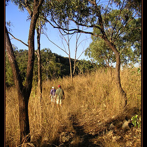
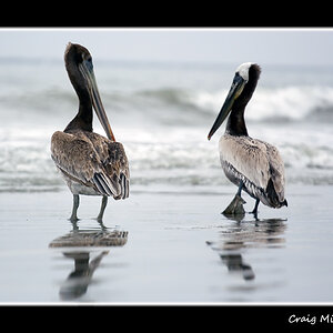
This is a nice image, but, for some reason, it does nothing for me. There is no "WOW" factor, not that there always has to be, but it is just a nice snapshot. Also, as I noted with regard to one of your posting in another forum here, the watermark does it in and maybe that is the problem, because, that is just the second place my eyes went when I first saw this image - to the watermark - it is distracting.
What are you using to make your present watermark and what software are you using to edit your images? Depending on what you have, there are a number of tutorial sites on the web on how to do decent watermarks. Let us know and you will most likely get some good suggestions.
As far as a "better" watermark goes, I would suggest that you place it in the lower left or right corners of your image and that it should be very small relative to the size of the image. When I put a watermark on an image, I try to make it no larger than about 1/4 of an inch and very light compared to the "colouring" in the image. If the lower right or left corners are impractical, then I would place along the left or right margin of the image. It should be a bit inconspicuous, in the sense that it should probably be one of the last parts of the image that the viewer sees, not the first or second thing they see.
If you want to see a reasonably decent watermark that is not too distracting, look at some of the postings by CoastalConn.

![[No title]](/data/xfmg/thumbnail/34/34144-52e7a5d3e3908ae808afeabfe86fffdc.jpg?1619736317)