Dahlia (x8)

Trenton Romulox

TPF Noob!
Joined
Mar 10, 2007
Messages
2,392
Reaction score
0
Location
Maine
Website
www.jeremygrayphotography.com
Can others edit my Photos
Photos OK to edit
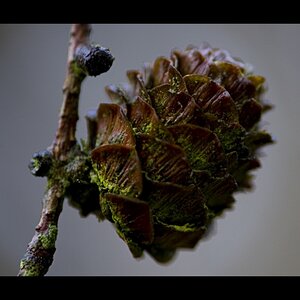
My brother brought in a dahlia from the front yard so I decided to mess around with it. I'm fairly happy with some of these.

1:
_DSC7126-Edit-2-1.jpg


2:
_DSC7082-Edit.jpg


3:
_DSC7104-Edit-2.jpg


4:
_DSC7099-Edit-1.jpg


5:
_DSC7106-Edit-1.jpg


6:
_DSC7125-Edit-1.jpg


7:
_DSC7126-Edit.jpg


8:
_DSC7129-Edit-1.jpg


Thanks for looking. Comments, critiques, and jokes are all welcome and appreciated.

Peace.
 
I like # 4 the best.
Interesting treatment on all but i like the grey to black gradient and the not so processed look of the flower.
Good job.
If you could make the bottle in 4 look like the bottle in 7 it would be perfect.
#8 looks like a painting.
 
Thanks for the comments, boogaguy. They are much appreciated.

I'm gonna try and work some more on the bottle in #4, brighten that ol' bottle up.
 
I'm partial to #4 as well, and I'd leave the bottle alone. I like it just the way it is.
 
Great work, I wish I could do these things. I like the whole set, except maybe #1 (too cartoonish for the subject, but just my taste) and #3 (too dark, can barely see the bottle). Number 8 indeed looks like a painting, and is probably my favourite of the lot.

You found a way to come up with 8 different ideas to shoot the same flower and the same bottle. Hats off to that.

How this thread has received just a couple of replies is beyond me, by the way.
 
Trent-

I think you did a nice job with all of them. I think #4 is nice but the flower seems a bit lonely in the frame. I'm enjoying #8 as the subject fills the frame a bit more. Though I think the top of the bottle in #8 is a bit bright and I find my eye wandering off of the flower and to the bottle.

Nice Job :thumbup:
 
Very creative TR, and nice work from the technical aspect as well.
 
I like #2 and #6 a lot. They are all really nice though.
 
I just love your flower work, and how you use light. Its like you make the flower more human by the way the light touches it... just so inspiring. 3,4 and 5 are my favorites with 3 being like the best. The light, again, is used perfectly.
 
1 and 8

I love the intense contrast in 1 which really brings out the details

the clarity and size of the flower in 8 really draw in your eye compared to many of the others
 

Most reactions

New Topics

Back
Top