
dhris
TPF Noob!
- Joined
- Nov 27, 2012
- Messages
- 53
- Reaction score
- 7
- Location
- Ottawa
- Can others edit my Photos
- Photos NOT OK to edit
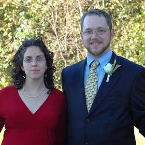
Here are a few reception photos from my second last wedding of 2012 at the Courtyard restaurant, Ottawa.
For more from the eve, please see: www.christopherstevenb.com/weddings/courtyard-restaurant


For more from the eve, please see: www.christopherstevenb.com/weddings/courtyard-restaurant


![[No title]](/data/xfmg/thumbnail/34/34063-09779b4ba56a0acb2b0fa36cf8720dfb.jpg?1619736260)
