Days of old

Demers18

TPF Noob!
Joined
Nov 11, 2011
Messages
1,330
Reaction score
265
Location
Sudbury
Website
www.flickr.com
Can others edit my Photos
Photos OK to edit
Went for a hike yesterday in Banff national park as I knew it would be one of the last times I'd et the chance to do so, for a long while anyway, as I'm moving to Sudbury in the very near future.

Felt the BW worked with the mood and how these could be only memories for a while.

#1 Days of Old

6977540704_0e60efdc63_b.jpg
[/url] Days of Old by lee.demers, on Flickr[/IMG]

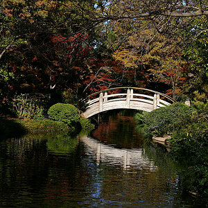
#2 Ice Age - taken at Johnston Canyon in Banff national park - The top Canyon

7123622671_502a883a85_b.jpg
[/url] Ice Age by lee.demers, on Flickr[/IMG]

#3 Lower Canyon - BW

6977539588_8e791d3734_b.jpg
[/url] Canyon from Bridge - BW by lee.demers, on Flickr[/IMG]

#4 Lower Canyon - Color

7123618855_8cd6023ca9_b.jpg
[/url] Canyon from Bridge Colour by lee.demers, on Flickr[/IMG]

I'm undecided whether I like the colour or BW version better, what do you guys think?
 
#1 my favorite of this set but it could use just a wee bit more contrast perhaps. I'd play with it and see, it's an awesome sight!

#2 looks right out af a textbook from the mid 60's.

I like the color version better but I don't like the crop, it's too narrrow a view for my taste but I love the water in the pool.
 
Nice images - always a shame when someone has to move away from this beautiful landscape. My only comment is about the colour in the last one - the snow/ice looks a little too blue and the water looks a bit too green from what I remember - yes this is within an hours drive of home - and I love the B&W conversions.
__________________
WesternGuy
 
Trever1t said:
#1 my favorite of this set but it could use just a wee bit more contrast perhaps. I'd play with it and see, it's an awesome sight!

#2 looks right out af a textbook from the mid 60's.

I like the color version better but I don't like the crop, it's too narrrow a view for my taste but I love the water in the pool.

Thanks Trevor,

I tried #1 with more contrast but found it to be a little too much.

As for number #2 that's the exact look I was going for. It's how I envisioned the photo when I took it. Happy that I was able to portray it that way.

As for the crop, I tried to move the waterfall out of the center a little as it was dead center. I'll try and see if there's another way to crop.

Thanks for the CC
 
WesternGuy said:
Nice images - always a shame when someone has to move away from this beautiful landscape. My only comment is about the colour in the last one - the snow/ice looks a little too blue and the water looks a bit too green from what I remember - yes this is within an hours drive of home - and I love the B&W conversions.
__________________
WesternGuy

I know, I'm glad I had the chance to be here this long and I must say I've taken advantage of it.

I was on the fence with the saturation but I liked how it showed the different colours the water can have in the different environments. As for the green, it was not adjusted at all, I was quite surprised myself how green it was.

Thanks for the CC Westernguy, much appreciated.
 
I like the B&W version of #3!


When I look at #1, it makes me want to see more, kinda like I want you to zoom out a bit, but not loose any of the detail.

This brings me to wonder if you have ever experimented to taking multiple shots (overlapping) of a landscape, and then having PS stitch them together for you. What this does is it allows you to capture basically any scene you want (really no matter what lens, or how expansive it is) with large format resolution. This leaves you with pretty expansive crop capabilities later on, and an over all expansive shot.
 
Good stuff - I'm going to have to get there sometime. A few comments. The tint doesn't do anything for #2, perhaps because it's a warm tint on an image of ice, or it could be just that the tint makes the highlights less white. I'd try it without or with a very slight blue tint. I prefer the BW on the last one. It looks a little tilted. I agree with previous comment about more contrast in the first.
 
KenC said:
Good stuff - I'm going to have to get there sometime. A few comments. The tint doesn't do anything for #2, perhaps because it's a warm tint on an image of ice, or it could be just that the tint makes the highlights less white. I'd try it without or with a very slight blue tint. I prefer the BW on the last one. It looks a little tilted. I agree with previous comment about more contrast in the first.

Thanks Ken.

As for number 2 that was the look I was going for. Reflects the mood of how I saw it. Although I will try the blue tint just to see how it turns out.
 
Dominantly said:
I like the B&W version of #3!

When I look at #1, it makes me want to see more, kinda like I want you to zoom out a bit, but not loose any of the detail.

This brings me to wonder if you have ever experimented to taking multiple shots (overlapping) of a landscape, and then having PS stitch them together for you. What this does is it allows you to capture basically any scene you want (really no matter what lens, or how expansive it is) with large format resolution. This leaves you with pretty expansive crop capabilities later on, and an over all expansive shot.

I haven't experimented with it yet however it is something I want to dabble in soon though.

Thanks Dominantly
 
Love the color in #4 good work!
 

Most reactions

New Topics

Back
Top