Desert Dreams: Who would have lived here?

The composition isn't really working for me on this one, I feel it needs more sky and I think the scene might have held more impact shot from an angle slightly from the left or right to capture a bit more of the vastness of the desolate landscape, but you already said you knew the comp was off. So, since the landscape isn't really helping a lot and the building is the subject here anyway, perhaps go for a square crop to isolate the building more from the similar color of the land around it. Zoom in on it a bit as well to get a better view of that great stone texture and that old wooden door. Just my opinion. :)
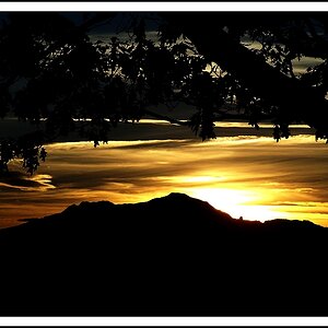
Thank you for the insights Carol, much appreciated.

Is this something that you can reshoot? The light has ruined what could be a good shot. Taken at either sunrise or sunset depending on where the building faces would be best. And you have too much dirt and not enough sky. Also if you could try a wide shot I think you might like it.
Sorry Amanda don't know if I'll be fortunate to visit the place again in my lifetime. ;) This was an unplanned vista that we chanced upon during our travels and to top it I had just begun to cuddle a camera, but will for sure try the learning in my future shots. Thank you so much.

Late to the party Jasii, but I agree with everyone above. It does seem worthy of staking out for a better time of day and better composition.
You came in late to ensure that the celebrations could go on longer :D
Thank you so much for dropping by with your bit.
Cheers!
Jasii
 
First, please forgive the very crude PSing.
The technical elements of sharpness, exposure, wb etc. are all excellent.
Perhaps sharpening only the building a bit to give it more dimension and contrast while preserving its darkness.
I agree with others about discomfort on framing. The building is at one side for no reason and the compostion seems off-balance.
To get a feeling of isolation, which is what the building alone seems to imply, I would have tried to get higher and show the empty space behind.

(Why flip it?
As an English speaker and writer, I am much more comfortable with entering from left to right - and the leading lines here are so strong right-to-left that it is a bit disconcerting.)

View attachment 109716

That fillip was pretty interesting :clap:
Thanks a ton for the advice. It helps to assimilate and digest advice from all quarters, digest the good understandable stuff and use it at the next opportunity. ;)
Gratitude!
 
Oh, Ladakh! I wish I had been there already, it's one of the most beautiful places on this planet.

As for the photograph, I think Tim's advice is spot on. Although if I were to shoot it, I'd probably see whether capturing a lot more of that beautiful mountains in the horizon would work for the composition, or maybe even a pano. Having said that, I'm not very good with the technicalities and rely more on my eyes to judge the image. All in all, pretty good capture and definitely worthy of a revisit during sunrise or sunset.
 
Hi Jasii, sorry to take so long getting back to your PM, but I have been in Africa and have just returned. I think the basic image is okay, but I am bothered by the fact that the mountains in the background seem to be popping out of the top of the building - I know they aren't, and that it is just compositional artefact, but it still bothers me. It is not an effect that I would want in any of my images. I would take parts of the last two shots - the one that shows some desert above the roof giving the perspective of where the building is relative to the mountains, posted by The Traveler, and the last one posted by Tim Tucker where he moves the building off centre. It is unfortunate that the front of the building is in shadow, so TCampbell's suggestion regarding HDR is a good one, but anything you can do to lighten the front of the building to bring out the detail would be a benefit in my humble opinion.

WesternGuy
 
Ok...I know this post has been up for a few weeks now, however I'd really like to add my own .02¢ worth here.

I do, for the most part, agree with most of the comments already made. I do like the shot as is, however I think a slightly better angle or better framing would have made this a genuinely outstanding image. I'm not even sure I can say that it's because it's "head on"...that doesn't really bother me, as much as how the building is placed relative to the background and foreground. It's good, but I think a bit more thought at the camera end could have made it sensational. I do think the colors are just spot on...totally fabulous sky and those clouds just pop!

At the terrible risk of sounding like someone who lives far too vicariously through his old VHS movies (LOL), the scene REALLY puts me in the mind of an old Clint Eastwood western. The house/structure itself really puts me in the mind of an early scene in "The Good, The Bad and The Ugly" where Lee Van Cleef walks into the guy's hacienda and has the bowl of stew (ah, those fabulous Sergio Leone closeups! LOL!).

I do also agree with the comments that suggest the building itself is just a bit too dark. Since you don't really have a strong protruding shadow, if it were me, I think I would take this into Photoshop (or other image editor), separate the building into it's own layer and maybe bring up the mid tone levels there a bit. I have to disagree with TCambell there in that I don't really think an HDR would really have been needed for this...the results might be interesting, but with a bit of creative editing work, I don't think it would really be necessary at all.

Likewise, I also think I have to disagree with TCambells comments regarding b&w here. Yes, I do feel that with some scenes such as this, perhaps a good sepia could lend itself to a certain sense of mood or nostalgia, however in this specific case I just can't help but LOVE those colors...just my own opinion, however I think it would be a genuine shame to trash them with a conversion. I'll use b&w or sepia -if- it truly adds something to the feel of the image...if there is a REALLY good reason for using it, however in this case I just don't believe that's warranted...just an artistic opinion.
 
The composition isn't really working for me on this one, I feel it needs more sky and I think the scene might have held more impact shot from an angle slightly from the left or right to capture a bit more of the vastness of the desolate landscape, but you already said you knew the comp was off. So, since the landscape isn't really helping a lot and the building is the subject here anyway, perhaps go for a square crop to isolate the building more from the similar color of the land around it. Zoom in on it a bit as well to get a better view of that great stone texture and that old wooden door. Just my opinion. :)
Agreed. This would look better with less foreground and more sky
 
Have been traveling, hence, seek apologies for the late response.
I take this opportunity of thanking each one of you who took the time to educate, validate, guide and egg me on. Thank you all you swell folks.
Cheers!
Jasii
 

Most reactions

New Topics

Back
Top