Design is hard. Need some input.

e.rose

Been spending a lot of time on here!
Joined
Jan 27, 2011
Messages
4,789
Reaction score
1,985
Location
Nashville, Tn
Website
www.emilymcgonigle.com
Can others edit my Photos
Photos NOT OK to edit
I. AM NOT. A DESIGNER.

I repeat.

I. AM NOT. A DESIGNER.

And lord knows that if I could hire one right now, I totally would, because outsourcing sounds like a DREAM right now... but that's literally all it is in this stage of the game. A dream.

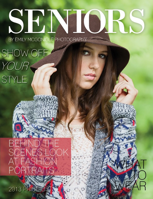
SO. As a result, I'm surrounded by 25,000 copies of Vogue, Bazaar, and Marie Claire, trying to gain inspiration for my Senior Pricing Guide "Magazine".

The inside pages and spreads, while not yet refined, are coming along okay.

The COVER, however... different story.

I had a totally different image than this one, as a place holder so I could start designing a few months ago, and once I dropped the actual image in all hell broke loose.

I spent a long while tweaking things, and thinking back to the "Design for photographers" book (or whatever it's called) that I read a while back, but I'm officially stuck.

This is what I got.

It's not quite there yet.

What suggestions would you make (about the design, not the image)???

I don't want to tell you specifically what I think yet, because I want to see what ya'll say... but I appreciate your input, in advance.

:salute:

9290959176_d7c730f933_o.jpg
 
Bolder fonts? I was having a hard time reading "WHAT TO WEAR" and "2013 PRICE LIST" The current chosen fonts just don't flow well with me. As far as information and placement on the grid, really not that bad IMO. I would bold your

...I was a yearbook editor in high school, but that was a long time ago so don't take my words too seriously lol.

I really think this looks pretty good and is in need of only slight tweaking... but thats just me!

I think that picture is great by the way, very pretty.
 
I agree. Not necessarily bigger, just bolder, maybe a different color. On the bottom of the page, the lettering just kind of "fades" into the picture when it goes over her seeater. Something to make it stand out a little more. It's ok on top on the hat.

Good Job!
 
I agree that the type at the bottom gets lost. Other than that I really like it - good job.
 
I really like the heading and the text in the red block, those work well. The image is also wonderful.

However as the other have said the font needs to be bolder. I would also align the "Show off your style" with your heading and the text in the red block. Not only will it look neater and more organized, it will also allow for bleed around your image with printing. The worst thing to have happen is to get some letters or even just parts of them cut off the side because they were too close to the edge. Although having said that, it is also not terrible where it is either.

With your "2013 Price List" the spacing above and below it is not equal. I would suggest moving it up slightly.

This one is merely a thought, don't know how well it will work, but perhaps moving the "what to wear" heading into the red box as well, separated by a line or something may look better, because "behind the scenes" can be linked to what to wear for a fashion portrait, kind of like a tips section... Right now the "what to wear" just looks slightly awkward where it is.
 
Emily; I like this mockup, but some of the text is hard to read, so I would just make them a little darker, and in the case of "what to wear" jus ta little bolder. Keep the red rectangle. Good design!
 
Font is better suited for solid back grounds. Do you have a less busy shot?
 
it will also allow for bleed around your image with printing. The worst thing to have happen is to get some letters or even just parts of them cut off the side because they were too close to the edge. Although having said that, it is also not terrible where it is either.

...

This one is merely a thought, don't know how well it will work, but perhaps moving the "what to wear" heading into the red box as well, separated by a line or something may look better, because "behind the scenes" can be linked to what to wear for a fashion portrait, kind of like a tips section... Right now the "what to wear" just looks slightly awkward where it is.

There is actually more bleed on the file than what you're seeing here.

I thought about adding another block element, but I think I only want the one there so it doesn't feel overused or repetitive.

I agree with all your other points though.

My biggest issue is figuring out what to do with "Show Off Your Style", because I feel like it's too close to the edge (Just in general, not because of the bleed), but if I move it to the right, it looks weird over the subject.

I dunno. :lol:
 
Emily; I like this mockup, but some of the text is hard to read, so I would just make them a little darker, and in the case of "what to wear" jus ta little bolder. Keep the red rectangle. Good design!

Yeah.....

Problem with this font is that there literally is no "bold" option. I'm not sure if their is a way to fake it like with the italics in InDesign... but I couldn't find one. I'm not totally fluent in InDesign though, so maybe there's a way.

Does anyone have any font suggestions that are close to what I have but a little bolder? I chose what I did cause I wanted it to be kind of sleek, and it worked with the last image I had, in but once I dropped this in, it doesn't stand out enough, obviously.
 
Ebrima
EngraverGothic
Euphemia
Franklin Gothic Book

I could keep going but there are a million fonts that look like that. You should post the image so we can all have fun designing a cover.
 
She has posted this image, but the idea of a cover was not in the works at that time.
 
Problem with this font is that there literally is no "bold" option. I'm not sure if their is a way to fake it like with the italics in InDesign... but I couldn't find one. I'm not totally fluent in InDesign though, so maybe there's a way.

Can you assign the font an outline? If your software allows it that's a good quick and dirty way to go bold with fonts that have no bold option.
 
The magazine is called 'Seniors' so maybe your model could be slightly older. There are great looking women that are in their 50's and 60's. Unless the magazine is aimed at high school 'seniors' then the model is just fine.

My opinion only and worth exactly the purchase price.
 

Most reactions

New Topics

Back
Top