Desiree

craig

TPF Noob!
Joined
Oct 30, 2003
Messages
5,600
Reaction score
21
Location
Hermosa Beach, CA U.S.A
Website
craigblank.com
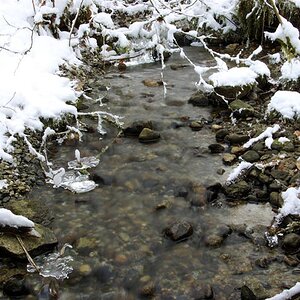
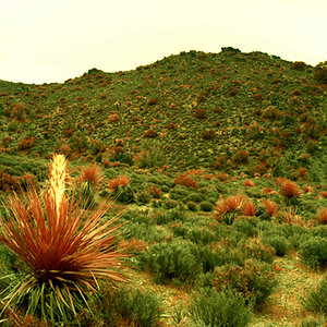
Tough colour on these. I am open to suggestions. Let me know what you think.

Love & Bass

20080621dsc0021ri1.jpg


20080621dsc0107ev2.jpg


20080621dsc0135wh0.jpg


20080621dsc0183gf1.jpg
 
She looks awkward in the 2nd. I like the light and color, its just the pose. I would have been better if her legs/feet where behind some of the wheat, I think....and the 4th just looks...well...awkward and posed also.

IMHO, you did good considering how hard the light was!
 
I quite like #3, but agree with Sarah on the poses. It seems to me that this was the wrong time of day to shoot in this location, given the sun effects.
 
I like the looks on 1 and 2, but the lights, man looks like a nightmare to work with the light.
 
Thanks for the comments gang! I have some more traditional poses and lighting maybe I will post them. These were my faves. I was looking for something different, non traditional.

)'(
 
Unfortunately, big models can be a tough gig.

#1. I would advise against any shooting position where some parts of the body are closer to the camera than others, including this low position. And the wide angle/close crop only makes her fill the frame more. In particular the elbow/forearm being closer to the camera makes it appear larger. As for color, I'd like to see a more neutral white in the body of the dress, and some brightness/contrast curves could help cut the highlight problem. This can be done in RGB but preferably in Lab, where you could steepen the A/B curves to bring out more color separation in the highlights.

#2. A good idea but taller is better. More body length will decrease the appearance of width. As for exposure, I feel this is a shot that would benefit either from stronger fill flash or subject underexposure and then teasing back out the detail in post.

#3. Good exposure but a little confusing. The image doesn't speak to me.

#4. Lengthening the torso helped somewhat but the posture is awkward, making the curve of her ass/back appear more like a hump and placing too much emphasis on those giant knockers. The flat light on the face I feel is detrimental. It rounds it out too much. Lighting from the side to increase shadows will add more dimensional qualities to the face, making it appear more angular and less round and large.

All in all, for these shots with this sort of model, I would increase fill flash to deal with the background exposure problem, and light from the side (make sure it's sun-side to avoid any directional confusion). I would emphasize tall, or long posture, avoid silhouetting at all cost, and make extra sure all extremities are as equally distanced from the camera as possible.
 
I agree with the comment about the giant knockers plus the way the dress is bunched in number 2 is also somewhat unfortunate. I wouldn't want a pic of my kid like that.
I did really like the 3rd one ...wish she had a happier expression.
 
Don't like the first one. She seems off balance in the second. I like the last two but i might crop a 1/5 off all the way around the third.
 

Most reactions

Back
Top