Did a major site redesign to achieve a more professional feel. Feedback appreciated.

achtungbarry

TPF Noob!
Joined
May 11, 2008
Messages
49
Reaction score
7
Location
Dublin, Ireland
Website
www.achtungbarry.com
Can others edit my Photos
Photos NOT OK to edit
Hi all.

I just did a website redesign as part of my preparation to setting up a small photography business. I will hopefully be fully up and running in early 2013. I've finally begun to generate some income from photography so it's time to set up properly.

I'd love your feedback on the site design: layout, colours, ease of use, gallery layout etc.

http://www.barryocarrollphotography.com/

Thanks.

Baz
 
Barry,

I wish I had some meaningful critique to help you with you site, but I don't. It is VERY good already. I'm viewing it on a 27" iMac on Firefox, and your fullscreen slideshow works perfectly. Your B&W images of Paris are extremely compelling...two images of a fountain in particular.

In my opinion, your site is already much more well designed and easy to navigate than many full time pro's sites I've visited. You've obviously put a lot of thought into its layout and design. Bravo.
 
Looks great on both my mac and also 4G mobile device, loaded relatively quick on the mobile too. NICE!
 
It's beautiful. It loads slooowwww.
The galleries you have nothing in-make them disappear for now. The fact that you have a million galleries in one area, but then one picture or gallery showing in another isn't flattering. It's not exactly obvious that when you click into a photo it will take you to a gallery. Really pretty minor in the big scheme of things.

Your about page should always be the second page in your site for SEO purposes. Your about has a lot of "I" statements and while they are correct, they aren't exactly quality writing. I understand that you believe the quality of light... But for you it should be a bold statement. IT IS that way.
You won? You were awarded the prestigious Tom Shanahan Memorial Photography Competition which is opened to all members of the photography clubs of Dublin. In fact that whole paragraph is a mess... Forgive me, but I am going to do some major rewriting. This is one of the areas that drives me insane on websites... I know, I've got issues!

Greetings from Dublin, Ireland. Although I enjoy experimenting with other genres from time to time I currently specialize in travel, landscape and cityscape photography. I am at my happiest combining my love of photography with my love of travel. There is nothing quite like exploring a new city with my camera at the ready
The quality of light is what really makes a photograph great and I endevour to shoot my landscapes and cityscapes using that light. An hour or so either side of sunrise and sunset is key to producing the images you see here. The hour or so prior to sunrise often gives scenes a wonderful pastel and tranquil feel. The rising and setting sun casts a golden low angled light over everything it reflects off as well as creating some wonderful shadows and revealing the textures not always noticed. The hour or so after sunset known, as the blue hour, is my favourite time for capturing urban landscapes as the city lights begin to come to life and night falls.


In 2009 I became a Licentiate of the Irish Photographic Society (L.I.P.F.) and in 2010 had my first gallery exhibition. All of which lead to being awarded the prestigious Tom Shanahan Memorial Photography Competition. I am currently preparing my Associateship (A.I.P.F.) and preparing for future gallery exhibits.
Artwork can be purchased on line or directly from me at any time. The ‘Prints’ section in the top menu will give you more details.
Please contact me if you are interested in using any of my work for commercial, editorial or personal use. If you have any questions or just want to say "hello" feel free to drop me a line through the "Contact" section of the website!

Browse my galleries, read my blog and enjoy!
 
I like the home page, nice slide show. It didnt resize itself based on my window though so just fyi.

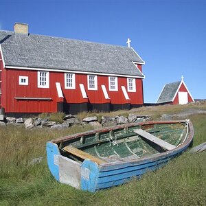
In the sea album for example there are several variations of the same boat. Just an opinion but might be nice to pick your favorite, people can freeze when given too many close choices.

you have some beautiful work.
 
The logo is aliased, and I'm on a Mac. I'd suggest smoothing out the text. It also does load a bit too slowly for my tastes.

However, I do think the overall look and feel is very nice. Good job.
 
Loaded nice and quick for me. It'sa very fluid and clear website. Well done.

I do agree about the aliased logo. You need to sort that - it spoils the cleanliness of the rest of the page. Overall, though - Nice!
 
Thank you all for your helpful feedback. Sorry about the delay in replying. I've had a few technical issues this week!

Barry,

I wish I had some meaningful critique to help you with you site, but I don't. It is VERY good already. I'm viewing it on a 27" iMac on Firefox, and your fullscreen slideshow works perfectly. Your B&W images of Paris are extremely compelling...two images of a fountain in particular.

In my opinion, your site is already much more well designed and easy to navigate than many full time pro's sites I've visited. You've obviously put a lot of thought into its layout and design. Bravo.

Many thanks James. I appreciate you taking the time to visit the site.

Looks great on both my mac and also 4G mobile device, loaded relatively quick on the mobile too. NICE!

Thank you for checking out the site and for your kind comments.

It looks awesome! What exactly did you use to make it?

Thanks imtravy. I used Wordpress to build the site. I used a premium theme called Expression.

It's beautiful. It loads slooowwww.
The galleries you have nothing in-make them disappear for now. The fact that you have a million galleries in one area, but then one picture or gallery showing in another isn't flattering. It's not exactly obvious that when you click into a photo it will take you to a gallery. Really pretty minor in the big scheme of things.

Your about page should always be the second page in your site for SEO purposes. Your about has a lot of "I" statements and while they are correct, they aren't exactly quality writing. I understand that you believe the quality of light... But for you it should be a bold statement. IT IS that way.
You won? You were awarded the prestigious Tom Shanahan Memorial Photography Competition which is opened to all members of the photography clubs of Dublin. In fact that whole paragraph is a mess... Forgive me, but I am going to do some major rewriting. This is one of the areas that drives me insane on websites... I know, I've got issues!

Greetings from Dublin, Ireland. Although I enjoy experimenting with other genres from time to time I currently specialize in travel, landscape and cityscape photography. I am at my happiest combining my love of photography with my love of travel. There is nothing quite like exploring a new city with my camera at the ready
The quality of light is what really makes a photograph great and I endevour to shoot my landscapes and cityscapes using that light. An hour or so either side of sunrise and sunset is key to producing the images you see here. The hour or so prior to sunrise often gives scenes a wonderful pastel and tranquil feel. The rising and setting sun casts a golden low angled light over everything it reflects off as well as creating some wonderful shadows and revealing the textures not always noticed. The hour or so after sunset known, as the blue hour, is my favourite time for capturing urban landscapes as the city lights begin to come to life and night falls.


In 2009 I became a Licentiate of the Irish Photographic Society (L.I.P.F.) and in 2010 had my first gallery exhibition. All of which lead to being awarded the prestigious Tom Shanahan Memorial Photography Competition. I am currently preparing my Associateship (A.I.P.F.) and preparing for future gallery exhibits.
Artwork can be purchased on line or directly from me at any time. The ‘Prints’ section in the top menu will give you more details.
Please contact me if you are interested in using any of my work for commercial, editorial or personal use. If you have any questions or just want to say "hello" feel free to drop me a line through the "Contact" section of the website!

Browse my galleries, read my blog and enjoy!

Hi MLeek. Wow ! Thanks for taking the time to give a great critique and very helpful suggestions for the about page. I will definitely use it as a model for a re-write. Thanks for the tip about the placing of the about page. As for the galleries, I have in the end decided to go with a simpler option with clickable thumbnails and less galleries. Simple is best in this case I think.

I like the home page, nice slide show. It didnt resize itself based on my window though so just fyi.

In the sea album for example there are several variations of the same boat. Just an opinion but might be nice to pick your favorite, people can freeze when given too many close choices.

you have some beautiful work.

Many thanks for the tips and for taking the time to have a look.

The logo is aliased, and I'm on a Mac. I'd suggest smoothing out the text. It also does load a bit too slowly for my tastes.

However, I do think the overall look and feel is very nice. Good job.

Loaded nice and quick for me. It'sa very fluid and clear website. Well done.

I do agree about the aliased logo. You need to sort that - it spoils the cleanliness of the rest of the page. Overall, though - Nice!

Thanks for the feedback. I'll sort out the logo issue.
 

Most reactions

New Topics

Back
Top