Did I go to far with PP? My niece in a field. CC please!

aliciaqw

TPF Noob!
Joined
Mar 28, 2010
Messages
219
Reaction score
0
Location
California
Can others edit my Photos
Photos OK to edit
I posted these on another forum last week, but I've since learned a few things in post that I thought I'd try out (not sure if it was forward progress, however).

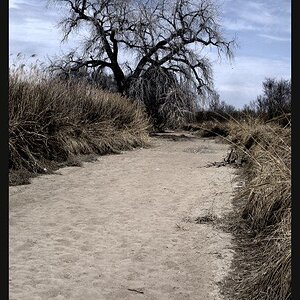
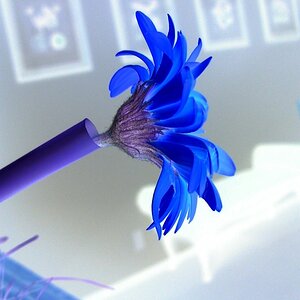
Is the PP on these ridiculous? I like it but I'm not sure if that's because I've been staring at the computer for so long that I just want to convince myself it's time for bed. Hmmm...

CC on everything is welcome as always. If you don't like the extreme "yellow", let me know, but it was intentional since I was backlighting. I may have gone too far. Still trying to find my "style"...ugh.

p.s. WOAH, these appear SUPER sharp. Didn't look that way in PSE... Eeks...

Thanks!

4621113170_683ed79aa7_o.jpg


4621113450_73342e80f5_o.jpg


4621113364_cf8893bf70_o.jpg


4620502553_92819f5481_o.jpg
 
Ya, like you said they look a little sharp. Also, some of the stray hairs are jumping out at me. #2&3 seem like its the same hair... Might think about removing them.

I love the shots though... Nice job!

4621113450_73342e80f5_o.jpg
 
Last edited:
All I would complain about is the sharpness, although it seems like that was sort of accidental! Also, for some of the photographs (particularly number 3), I would recommend only sharpening the girl's face. Number 3 is a wonderful photograph, but my eye is drawn to the wheat (or whatever it is :S).
 
Nice photos. I love the last one. If you just soften them up a bit they'll be great. I really love the look of all your photos!
 
They look over sharpened and over saturated, the over sharpening wont have helped with the blown out highlights, it will only excentuate them. They are cute images, they stand alone from a compesitional point of view, I would be inclined to selectively sharp ( within moderation) areas which are soft, and use the history brush to remove any process that will further blow out the highlights, I suppose contrast is one of the main culprates. Using the history brush at varying opacity will leave you with 'hints' of processing' or remove them completely. A seriously valuable tool.

Love No 4, its very ambiguous out of context, she could be going for a picnic, leaving home ( like lots of us threatened too!) it's charming.

Emma
 
Thank you for all the CC. I'll ease up on the sharpening for web next time :)

Jason, did you use cloning to remove the hairs?

I like the idea to soften up the "wheat" in #3.

Also, I think the contrast/saturation of the background is due to my recent obsession with the burn tool. I increased the blacks in levels for the background, too (I masked her out when I did all this).

Thanks again. I'll play around with this some more today :)

And yes, my niece is quite the model. She had tons of suggestions and needed very little direction. I have more where she's smiling but she opted for the the looks she "sees models do on TV". LOL. Gotta love 7 yr olds!

Here are a couple of B&W. Are the conversions OK? Any blown highlights were intentional but are they too distracting? Too sharp also?

4588798651_abf5d91002_o.jpg


4588798901_05c3faf2ac_o.jpg


4589420174_bc6a1f1ede_o.jpg
 
Wow I LOVE them! I do think the first one is overly sharpened throughout the photo, and as someone else suggested just sharpen her face, or just her. I LOVE the colors, high contrast, oversaturation, and vivid details!
 
I really like this one...

4588798901_05c3faf2ac_o.jpg


The only thing is... she looks almost angry.

She wasn't angry. The sun was getting in her eyes and that is the same EXACT look her father (my brother) often has.
 
Wow I LOVE them! I do think the first one is overly sharpened throughout the photo, and as someone else suggested just sharpen her face, or just her. I LOVE the colors, high contrast, oversaturation, and vivid details!

Thank you! I was kinda going for that oversaturated look, but wasn't sure I had gone too far. Some people like it, some don't. I'm on the fence.
 
Very nice work, a pleasure to view (minus the over sharp everyone is talking about ;)).
 
All the BWs appear to a bit blown - I do like the bright look and the model and scenery work well with that but I think it's a bit too much.

Still, very nice pictures!
 

Most reactions

Back
Top