o hey tyler
Been spending a lot of time on here!
- Joined
- Aug 3, 2009
- Messages
- 9,784
- Reaction score
- 2,727
- Location
- Maine
- Can others edit my Photos
- Photos NOT OK to edit
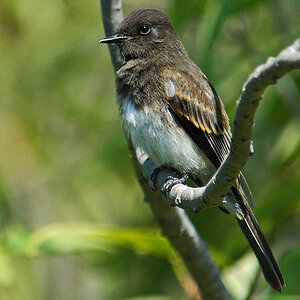
Busrider, IMO your B&W conversion is way better than the original.
Changing it to B&W eliminated the distracting orange blotches that the OP refused to get rid of because he doesn't believe in making his photos better.
Your ability to realize that the OP isn't submitting a photo to National Geographic and therefore has no reason not to improve his photo via simple cloning is amazing.
Thank you.
And imnick, you're not "the shat" because you got published. It's great publicity, but it's not worth getting your panties in a bunch. I get published every month, but I still look for ways to improve my photos, and I welcome in edits that people might suggest, or try for themselves.
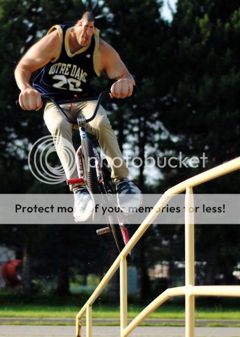
On top of all that, you really can't say anything because you gave EVERYONE the OK to edit your photos. Mind if I do one? Here it is:



![[No title]](/data/xfmg/thumbnail/33/33031-909b1e1ff8739eef165c60b70c9a6a38.jpg?1619735845)
![[No title]](/data/xfmg/thumbnail/39/39472-acea19526f2c08f92fd1e95a92191bc2.jpg?1619739043)
![[No title]](/data/xfmg/thumbnail/34/34115-73b827c6a6db1413dcead11e4caaae69.jpg?1619736285)

![[No title]](/data/xfmg/thumbnail/33/33029-f4556b4c89cecbad12ebe6b782a51ef5.jpg?1619735843)
![[No title]](/data/xfmg/thumbnail/35/35224-c14babe4157e05767660f47e7de82aef.jpg?1619736959)
