The Why Not Guy
TPF Noob!
- Joined
- Oct 26, 2005
- Messages
- 36
- Reaction score
- 0

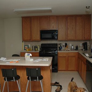
ISO 200
Exposure 3.2 seconds
Aperture 5.0
Ok, so here's the deal. The magazine I design needed a cover shot for a story about a particular restaurant, and I just happened to be going there for a birthday party. I've never done anything commercial but I said I'd give it a try. I didn't want to disturb the other patrons, so I tried to work as quickly as possible, and this - along with my nervousness - led to some silly mistakes. Still, the final pictures turned out better than I'd expected so I'm sort of half proud of them for a first try. Still, they could use a lot of improvement, and any feedback is welcome.
P.S. since it's a magazine cover the relatively empty bands at the top and bottom are for masthead/headline.
![[No title]](/data/xfmg/thumbnail/35/35865-5006be46d328277e5a956fa323782d97.jpg?1619737192)
![[No title]](/data/xfmg/thumbnail/36/36134-64e77d33cc4c68e1253adc2879f24a96.jpg?1619737387)

![[No title]](/data/xfmg/thumbnail/34/34041-c8aed4d2c55b167d1ec03d9cfbaca453.jpg?1619736250)
![[No title]](/data/xfmg/thumbnail/34/34042-f37784c4a5db3d0cf34059cad22b288c.jpg?1619736251)