The clouds look alright in both photos, actually. I like the original a bit more, though... the edit is straddling the border between vibrant and over-saturated. Nice photograph overall, however.
I'd also go the original as well, at least for the sky (clouds) the edit looks a little over done (to me). For the base of the image the extra saturation looks fine on the edited one.
Thanks for the input. It's Bermuda. The roofs are used to collect rainwater since that is their only source of fresh water. The white color is a lime coating which helps purify the water.
NateWagner: If by "base of the image" you mean the land, then yes I agree with you. I like how the land turned out but was wondering if the sky was overdone. I added a neutral density filter in Lightroom for the sky so maybe it will look better if I remove it.
I am a fan of very vibrant, saturated colors so maybe it's just my style. I know that it overwhelms a lot of people but that's just me, haha.
Thanks for the comments everyone.
P.S. I have many more photos from this trip so expect to see another thread with requests for more CC
Personally what you did to the sky in the edit competes with the land. I think a softer cleaner white as opposed to the darks you pulled out of the clouds would help since the homes appear to be the focal point. As of now the clouds are barely visible yet still manage to add a grungy feeling to the image, something that in my opinion holds it back.
The land editing you did was superb, on a side note.


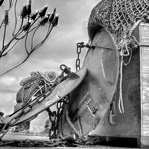
![[No title]](/data/xfmg/thumbnail/33/33440-0778f3522902634844facab43c5a29fa.jpg?1619735969)
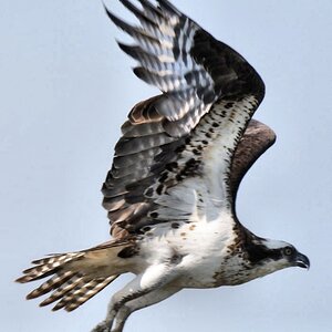
![[No title]](/data/xfmg/thumbnail/42/42468-f720ff996eb9cc6554c0019901223156.jpg?1619740193)

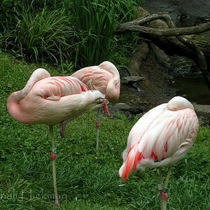
![[No title]](/data/xfmg/thumbnail/42/42464-98a778e864f4e6df2a9cc673b7549322.jpg?1619740192)
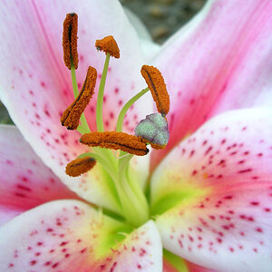
![[No title]](/data/xfmg/thumbnail/40/40286-86401b94de8b01bea8bb4ea154aaea0a.jpg?1619739408)

![[No title]](/data/xfmg/thumbnail/40/40285-2ce5915035c220ccb3485030863b62d0.jpg?1619739408)