do your worst ;)

volleysnap

TPF Noob!
Joined
Sep 11, 2007
Messages
45
Reaction score
0
Can others edit my Photos
Photos OK to edit
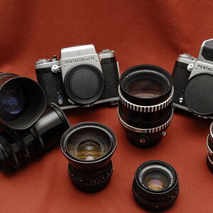
I took this late this summer. Don't hold back on comments!

1363181996_802d570b65_b.jpg


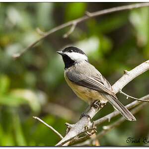
*removed the link so the photo is displayed directly in the thread.
 
IT'S AWFUL!!!!

No no..JUST KIDDING!

I really like it...the softness only adds to the peaceful quality of a once forgotten area of land. (in the viewers imagination it would be abandoned anyways)....at least that's what I'm getting from it.
 
I like the composition, but two things bother me.

#1 The sky is non-descipt.
#2 The guardrail at the bottom makes me think Interstate rather than Private Property.
 
I suppose I like the green. It looks warm.

I think it fails in composition though. Distracting elements and nothing to lead me around the shot. I don't care for the way the top of the sign is even with the top of the vegetation in the background. Lot's of wasted space on the sides too.
 
thanks for the replies everyone!

I like the composition, but two things bother me.

#1 The sky is non-descipt.
#2 The guardrail at the bottom makes me think Interstate rather than Private Property.

#1 is good-i hadn't thought of that
#2 it is actually a railroad track (the sign reads private property no trespassing trans pacific RR) but i can see how you can't tell-i will rethink composition!
 
I don't think it looks bad. The low contrast reminds me of a scene out of a scary movie.
 
1.White balance
2.I don't know if its the lens, but there is some darkening around the edges
 
It has a definite color cast (greenish-red?) that doesn't sit right with my eye. Also, the blank sky at the top doesn't sit well with me... if it were mine, I'd probably crop to 4X5 format, losing most (but not all!) of the sky. This would also cut out the vegetation "growing" from the top of the sign... I dunno. Maybe the sky would work better for me without the color cast. Also, although it took me a minute to realize it, the sign is off-center left-to-right, but looks centered vertically (the image is taller than my screen resolution, so it's a little hard to tell). This would further my thinking for the 4X5 crop.

Looks like you've added a slight vignette-type border around the edges. I'd also do a bit of it at the upper corners, darken the sky a bit... might also help. But then again, it's a particular style I'm fond of, and might not fit your tastes.

On the plus side, the overgrown sign is pretty neat, and I like the layering... vegetation in the foreground, sign, tracks, field, trees in the background. Depth of field looks great, really working with the layering effect. The contrast looks fairly good, although the color cast makes it a little hard for me to tell.
 
I tooled with the white balance and midtone contrast (a tiny bit)....it brightened up the sign a little, which I like.

1363181996_802d570b65_b_edited-1.jpg
 
ooo that is nice- what does everyone else think?
 
get rid of that weird border or vignetting or is that the lens?
 
Boring pic. nothing of interest.
 

Most reactions

New Topics

Back
Top