Does this work???

wxnut

TPF Noob!
Joined
Sep 9, 2004
Messages
594
Reaction score
7
Location
Wisconsin
Website
www.dougraflikphotography.com
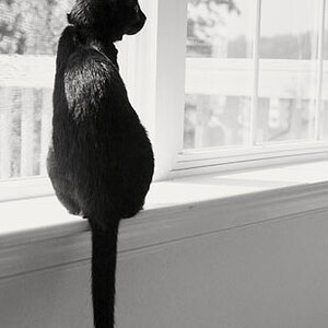
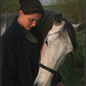
Wanted to go half abstract, and half normal. Does this image look pleasing to the eye, with a edge that slightly comes out and nips you, or does it just look too whacky? No candy coated answers please. Tell the truth.

stacyps.jpg


Doug Raflik
 
hmmm...It depends what this is being used for. i can can see what your doing but the two images jar to me. The negative space around the subjects doesn't really work with the sizes of the two images. Its a bit neither here nor there...i think also if you want abstract you could maybe commit more to that effect, give it more depth and range. For example you could make the face picture larger...covering one side of the shot and fade it out more so its barely visable....then overlay the body shot......or alternatively make the face shot the 'main' image with no opacity and use the body shot smaller........ either way i think it would help the overall composition. Hope this helps
 
I doesn't work for me, but I'm not usually a fan of this style of image. I think it would be better with just her standing and the outline. The dim image is a distraction for me. I'd rather see each on it's own.
 
As a viewer I would rather see her wearing the same outfit in both shots. Those colors (green and purple) dont work well, even if the purple is faded. I like the image of her in the green shirt better than the second one. I agree with MarkC on that. Plus there are white spots around her head in the second shot. A cropping error it appears. Over all the faded image is too much.
 
Excellent camera work and excellent post processing. I admire the talent that created this image. I like everything except the outline. I find the outline way distracting.
 
hmm for me it looks a bit like a poster from Bravo or this kind of girlish magazine... and I dunno what did you want to achieve... a blond pop-star? coz it looks like this:)
 
to my untrained eye, I'd say bring the 3/4 image out to the front and put the faded head shot more in the background, this will increase the contrast between the two. Right now, it seems like the two images are competeing for my attention. I think there should be a definite dominate and subordinate relationship between the two. But remember, its your art, only your opinion truely matters.
 
I am not feeling the white outline...and the darker image is kinda distracting to me.
 
I think I would like it without the fadded image... I think the biggest distraction (to me) is the white part of a background showing threw her hair in the faded image. maybe a different faded image or like Archangel said about it... Id play alittle more with it. but might dig it if it was just her the outline and nothing else framed the same, with negitive space. but play around with it abit.
 

Most reactions

Back
Top