doug - a few senior shots

thebeginning

TPF Noob!
Joined
Jan 10, 2005
Messages
3,795
Reaction score
30
Location
Texas
Website
www.danielcolvinphotography.com
Can others edit my Photos
Photos NOT OK to edit
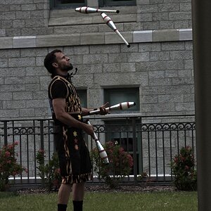
a few recent ones...nothing special, i'm not ecstatic about some of the poses (my fault), but they liked them so that's what matters :)


IMG_7900-sm.jpg


Doug025-sm.jpg


Doug031-sm.jpg


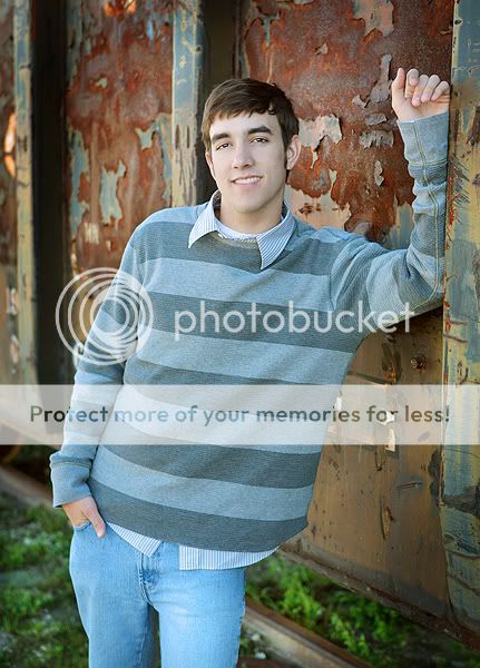
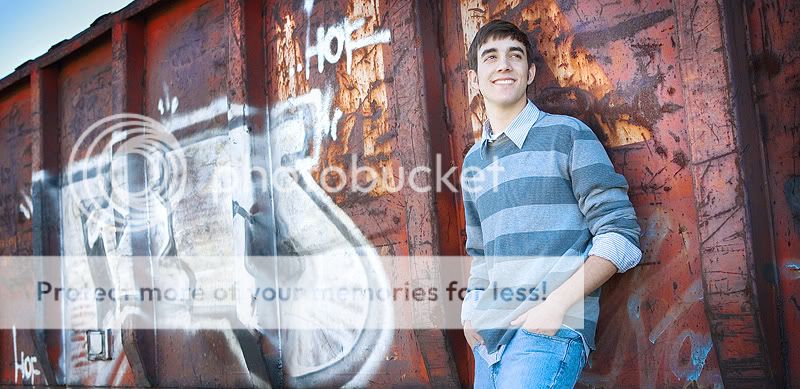
***how does the skin tone in this next one look to you guys? what's off? something seems off...I dunno it might just be his skin (or because of the light and i'm tired so i can't pick up on it)
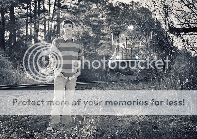
Doug066e-sm.jpg


a train came:

Doug073bw-sm.jpg


Doug077-sm.jpg


thanks for looking everybody!
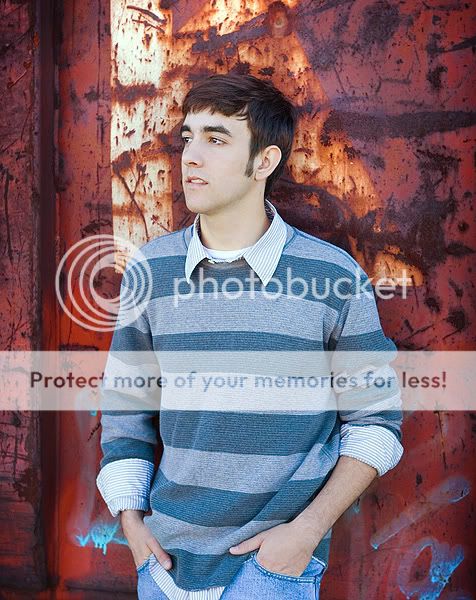
 
Nice set... with the skin tone on #4 he does look a bit pastey to me? but maybe its just his skin??? i like his expression in #3 and the b&w train is great too! x
 
6 just looks way too fake for me.
 
Daniel,

This looks like a fun location to shoot at. My biggest critique for these would be his head tilt. Particularly in 1 and 5, his head is tilted in a feminine manner and a simple tilt the other way would make him look more masculine. Also in #1, with his head tilted that way, his body creates a feminine S curve instead of a masculine C curve. His expressions are all great in all of these though.

I like the train going by and it's too bad you couldn't get more of a star effect with the sun shining through there.
The headshot looks fine to me. The skin could use a little boost. Try taking the cyan levels down in the REDS on a selective color layer. Did you boost the midtones a lot on this one? I like how you have the warm sun as a hair light but it is also shining on his nose a bit and that's distracting (along with the light on his shirt). Do you have a translucent reflector by any chance? This would have been a great opportunity to have the low setting sun diffused through a reflector to give some great light on the face.

The B&W isn't hitting the mark too well for me. I think the scene is too busy to be B&W and his shirt being the way it is doesn't help the situation. All I'm saying is it's hard for me to want to focus on the subject. Try darkening the background a little and see if that can help focus the attention on him.
 
I think these look great. I like the suggestions given for the Black and White by Jubba. Love how his eyes really stand out in #4 as well.
 
...i'm not ecstatic about some of the poses

I dunno... I don't think you're so far off. The only small "tweak" that comes to mind right away is: rather than having him put his fingers in his pockets, try having him put his thumbs in and then closing his hands (make a loose fist).

The strips are not as busy as others, but maybe that's what's bothering you. And the first three don't feature you usual, nice lighting ratio. But I find it a fair trade off. I would have definitely made the same choice to use the very nice background, especially in the first.

Very cool that you're shooting seniors now!

Pete
 
looks good to me.

good choice with that rusty container, it makes a great backdrop, full of colour and texture.
 
OK, this is why the last one looks fake:

The timing on the sun is too perfect and the light on the subject is completly different than that of the train. He's lit too even and the darkest point on him is towards the sun, not away. The highlights on his hair also work to throw it off.
 
In the UK I'd get jailed for being that close to a train!!!
 
Great images by the way!
 
I really like these, he look very comfortable, IMO often guys just don’t look at ease in pics
 

Most reactions

New Topics

Back
Top