Driftwood C&C

Destin

Been spending a lot of time on here!
Joined
Sep 11, 2010
Messages
3,864
Reaction score
1,383
Location
Western New York
Can others edit my Photos
Photos OK to edit
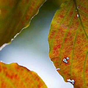
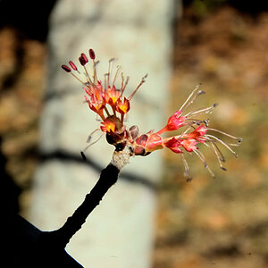
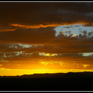
Still shaking the rust off of my photography skills. Took some advice from a few members on here based on my previous thread and tried to make my image more photorealistic (or at least less "cooked") and also tried to place more emphasis on a subject rather than just a view.

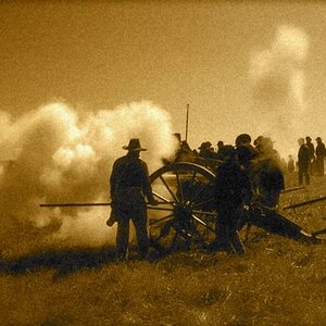
C&C is greatly appreciated, as I'm trying hard to improve! I've got thick skin, you aren't going to offend me.

Specific areas I'm concerned about: Composition and Post Processing.

DGD_0182_HDR.jpg


Thanks!
 
Hope you are thick skinned... ;)

No, kidding, I don't think it's that far off. The biggest thing it probably has against it is that everybody shoots driftwood on a beach so everybody's seen it before.

I'll C&C the two areas you asked about and give my opinion on possible improvements.

Processing: I noticed you've named the file with 'HDR'. What I see in this image and what happens when you use global tools is that you equalise the tones and contrasts within the image. Everything seems to have the same range of contrasts and colours and looks very similar to everything else. SO the image looks quite flat.

There are some great tools available that allow you to select and adjust not only locally, but also fairly invisibly (as long as you don't go too far). To see how this effects the image I've introduced some variation.
  • Removed slight colour cast. This instantly gives the image more contrast between colours. It's ok to have a colour scheme that uses a limited palette, but al a slight cast does is to add the same tint to every colour.
  • Raised the bright areas to closer to the white point. This does not really affect the image much, though you have to be mindful of making the colours too white. What it does do is allow you to display more contrast within the image. You only have a restricted range of tones with which to display, and your maximum contrast is the difference between the brightest and darkest tones you display. If you place most of your tones within the lower half of the range then you effectively half the contrast.
  • Added some variation. I've given the foreground more brightness and contrast relative to the background. By doing this I can also avoid over-brightening the sky and washing out the colour.
Composition: Probably the biggest point is the horizon. This is not a photographer OCD thing. We see by comparison and are generally good at levels, (our balance is affected by it). Also you have provided two perfectly horizontal and parallel lines in the frame as a reference by which the viewer can easily see the difference in your horizon. So I've corrected the bow and the level. We use the frame as a reference grid to judge balance and symmetry, so it makes sense to think about how your subject is placed with reference to the frame.

Offered as an alternative so you can see the difference, and below I've directly contrasted against your original (on the right) so you can judge the differences more clearly:

edit.jpg


edit-compare.jpg
 
Thumbs up to both of you. The OP made a nice photograph. Tim Tucker made it better. My suggestion to make it better would be to have shot with the camera closer to the ground. It would have put the vertical limb past the horizon and into the sky to make it more dramatic. Nice job, gents.
 
Thumbs up to both of you. The OP made a nice photograph. Tim Tucker made it better. My suggestion to make it better would be to have shot with the camera closer to the ground. It would have put the vertical limb past the horizon and into the sky to make it more dramatic. Nice job, gents.

I completely and totally agree, however with the tripod I have this is about as low as I could go.
 

Most reactions

New Topics

Back
Top